Loading
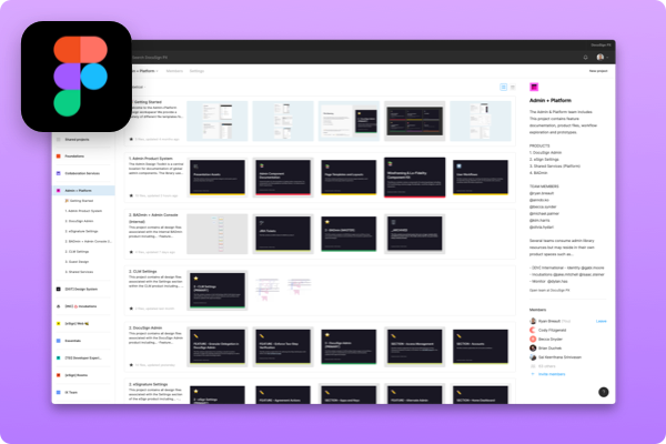
DocuSign hired me at DocuSign to create a system for the Admin product suite. A lack of design resources and design guidelines led to a highly inconsistent. Additionally, the company’s desire to create the Agreement Cloud resulted in unifying applications, including admin products. Our design team needed reusable components and page templates to increase efficiency and a consistent user experience.
I served as the lead designer for the product system, including the inventory of all product screens within the DocuSign Admin and eSignature Settings, creating design resources including components, usage documentation, page templates, and evangelism resources through presentations and training sessions.
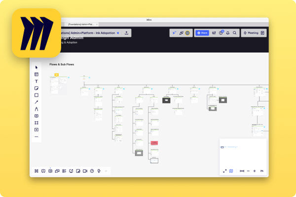
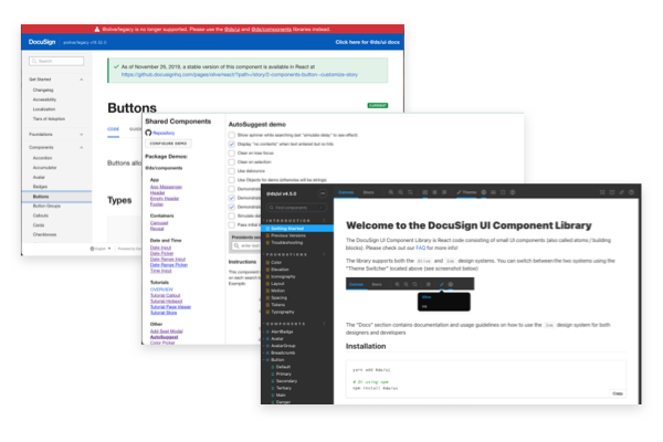
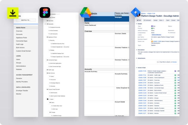
Previously the Admin team built the libraries in Sketch/Abstract; however, the company decided to move to Figma, leading to a separate but related effort of translating all relevant project assets. See Figma Migration Case Study.
After completing the library, I was responsible for reviewing the admin and platform team feature work, enforcing design standards, teaching other teams how to apply similar system organization and managing updates to the library.
Guest Development describes the act of one team-building something for another team’s site. The process facilitates the sharing of design and engineering resources across the groups. A team may own the customer-facing feature; they may or may not own the development for the admin setting that coincides.
Before joining the admin team, the admin team completed 90 guest development requests without design review. The high team and company growth rate inevitably led to increased demands, with the first quarter of 2020 producing over 100 submissions.
Years of guest development with no design review meant the admin user experience led to a wildly inconsistent experience from section to section, with users having to relearn the behavior of each page and workflow.
At first glance, our problem seems like a traditional design system would solve it. A coworker presented a diagram illustrating the spectrum of a design system, forcing me to realize that our efforts would skew heavily to the right side of the spectrum.
There is often a gap in design systems due to the necessity of serving the entire organization; the UI and guidelines they create need to be as flexible as possible, leading to many open questions around how to implement and customize those building blocks for a specific application.
Instead, we decided to pursue a product system that could grow into a cross-practice capacity. It is a model where product teams define their guidelines and principles influenced by the design system foundations and UI.
This approach was necessary because multiple teams and products consumed our system and would feed into the existing central design system.
Components of a product system extend beyond the design practice and have quite a bit of overlap. We want to focus on anything that can serve multiple disciplines. The term ‘system’ simply refers to the interdependency between those components.
Some of the items we focused on for the product system initiative included...
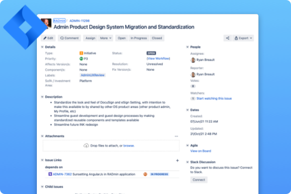
An excellent example of the interdependency of the product system is the documentation for a complex component that informs the designer how to structure the experience. Still, engineering consumes it during handoff while also citing it for advising teams around similar future work.
The success of the product system depends on how easily knowledge translates into new features. As individual contributors, we need to understand better how the system works to identify gaps.
To make adequate resources, I needed to understand what exists in our product space, including...
There were several products to consider when conducting an inventory and building a compelling product system.
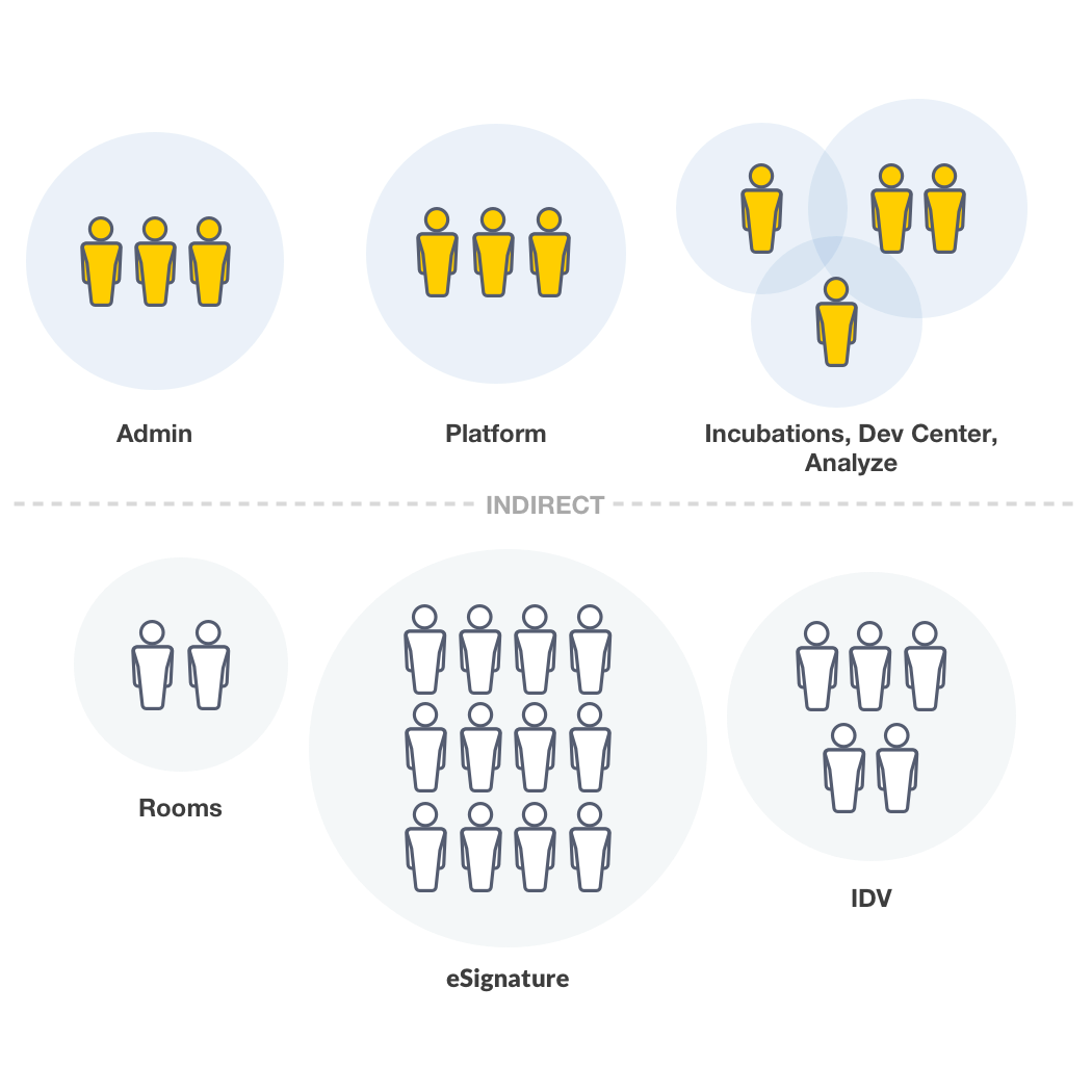
To build a resource that serves its community, I needed to understand all the individuals consuming the system. The system was intended to serve the immediate admin and shared services team members, which included…
Our team's success led to the expansion of the system to adjacent product teams responsible for portions of the DocuSign Admin experience. Each team had 1-4 designers and are continuing to grow.
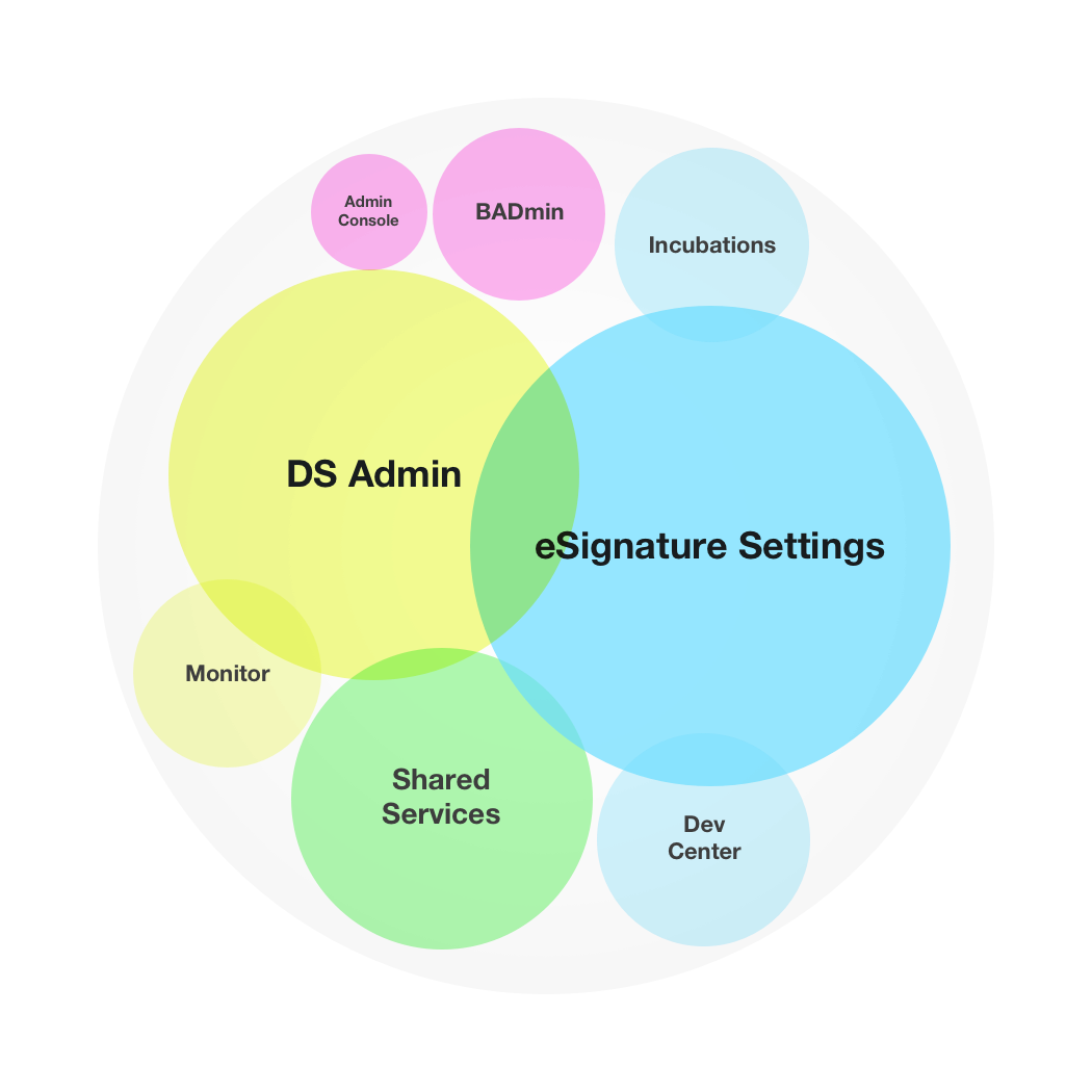
It’s worth mentioning the kit is only applicable to the eSignature and DocuSign Admin product; however, we predict the system expanding influence to other Agreement Cloud applications, such as Rooms, CLM, and more.
Before joining, two of my teammates conducted an inventory exercise for the Admin of eSignature Settings and DocuSign Admin to identify all needed UI. The activity was precious because it provided a rough site map of the products themselves while also helping the team understand which components are needed in our resource library.
The inventory evolved to accommodate subpages, workflows to inform…
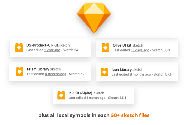
The team's workspace was in severe disarray. When I joined DocuSign, Abstract was the primary sketch file management tool. I quickly discovered that the 209 projects with more than three-fold sketch files. Luckily, I was only tackling the Admin & Platform space; however, we collaborated with many other product teams to deliver features and understand where file ownership extended beyond our group.
The goal for the workspace was to reduce redundant and outdated projects and apply a framework to which any designer could quickly locate files and resources.

There were five different shared libraries in our workspace and hundreds of detached local symbols scattered across project files.
Lastly, we can’t forget the code libraries that engineers build the products.
The design team referenced several code libraries and documentation sites. Sometimes these sites and libraries would provide conflicting information.
Creating a structure for our product required an easy-to-understand framework to ensure the team's success and expansion into other product areas.
I relied heavily on an article by Linzi Berry discussing Lyft’s four-tier distributed ownership model. The main principle of the model is guidelines and attributes from higher levels serve the needs of the lower classes, all converging from general to more specific.
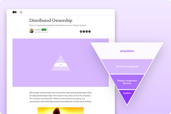
I decided to adapt this same structure to our product team with more Docusign-friendly nomenclature.
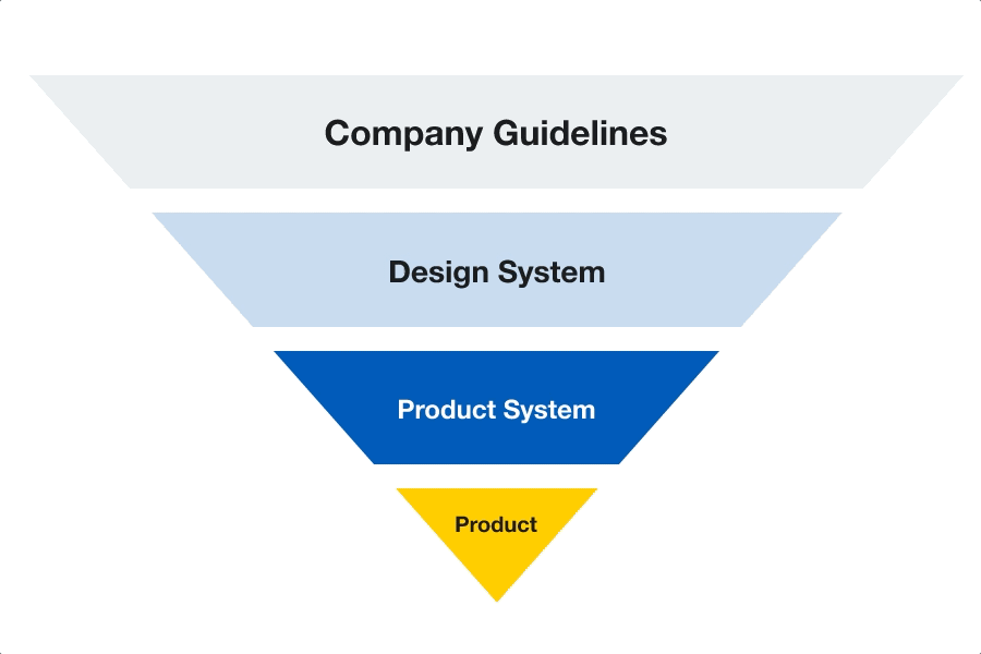
The company guidelines sit on the top and inform the entire company in all spaces, not just the product. These guidelines include...
Directly below company guidelines, there is the Design System layer. This level contains guidelines that all the product teams must abide by when consuming central design systems such as...
Our systems team are experts in this space and were confident they would make those informed decisions so that the Admin team could align with the broader DocuSign organization and future-leaning Agreement Cloud.
The design system’s attributes and guidelines flow into the product system level. The product system level is where the bulk of our system resources live and contains items such as...
If you notice on the diagram, components have an arrow pointing to the design system level, highlighting how components at the product level are transferable to the design system.
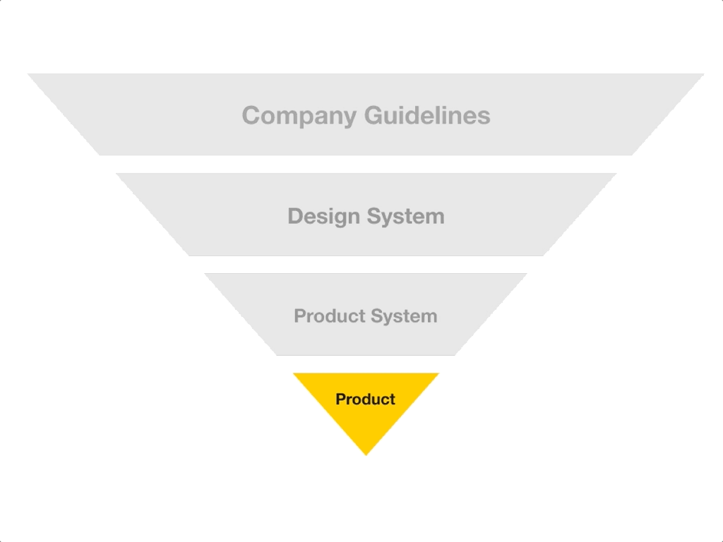
At the very bottom, we reach the highest level of specificity, the product level. The product level is where the new and exciting feature exploration occurs.
Design decisions are made and new components are tested and validated in the layer. Once approved, we elevate the pieces to the product system level or potentially the design system level if applicable.
For example, our team re-designed an Add User Workflow in the DocuSign Admin last year. The workflow became a multi-step workflow template and converted to a page template resource. The page template lived in our product system library and influenced the shared workflow stepper component of both central design systems' shared workflow stepper component.
Using the levels to inform naming conventions and project structure helped ensure the refined designs and components flowed to the top. We even implemented a similar approach for our layers inside our files and other product areas like JIRA and Google Drive.
Each product workspace contains a variety of different files. This initiative's essential component was to have a scalable space that would allow designers to locate similar designs quickly and product screens and understand how to structure new projects. We converted each file into a template for easy duplication and detailed documentation and recommendations around naming conventions and layer structure.
The initial draft of the product system was completed after six months and yielded several notable deliverables.
Before, we might have had up to 6 linked libraries in a given project, which made finding the correct symbol in the menu difficult and degraded the performance of the files themselves. Consolidating the team’s libraries to all reference a single library made locating relevant components significantly easier and cut down on recreating complex features.
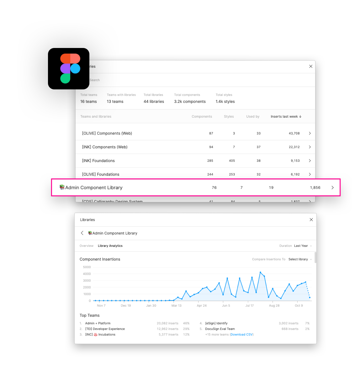
An excellent example of the efficiency gained from the Shared Component Library was the Data Table component.
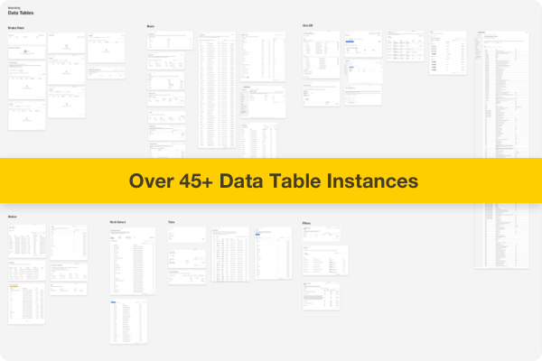
We had over 45 instances of data tables across the two products, all with varying design approaches and behavior. The inventory helped identify the overlaps and inform the creation of an all-encompassing pattern that could accommodate our products' wide range of use cases.
Each pattern consisted of several pieces of documentation, commonly found in design systems.
One of the most valuable assets in the product system was the PRIMARY product files. These files contained a snapshot of every page in a particular product and were used to inform designers of the most up-to-date design for a section.
These sections would be referenced as a starting point for designers and replaced with the newly approved designs by their respective teams.
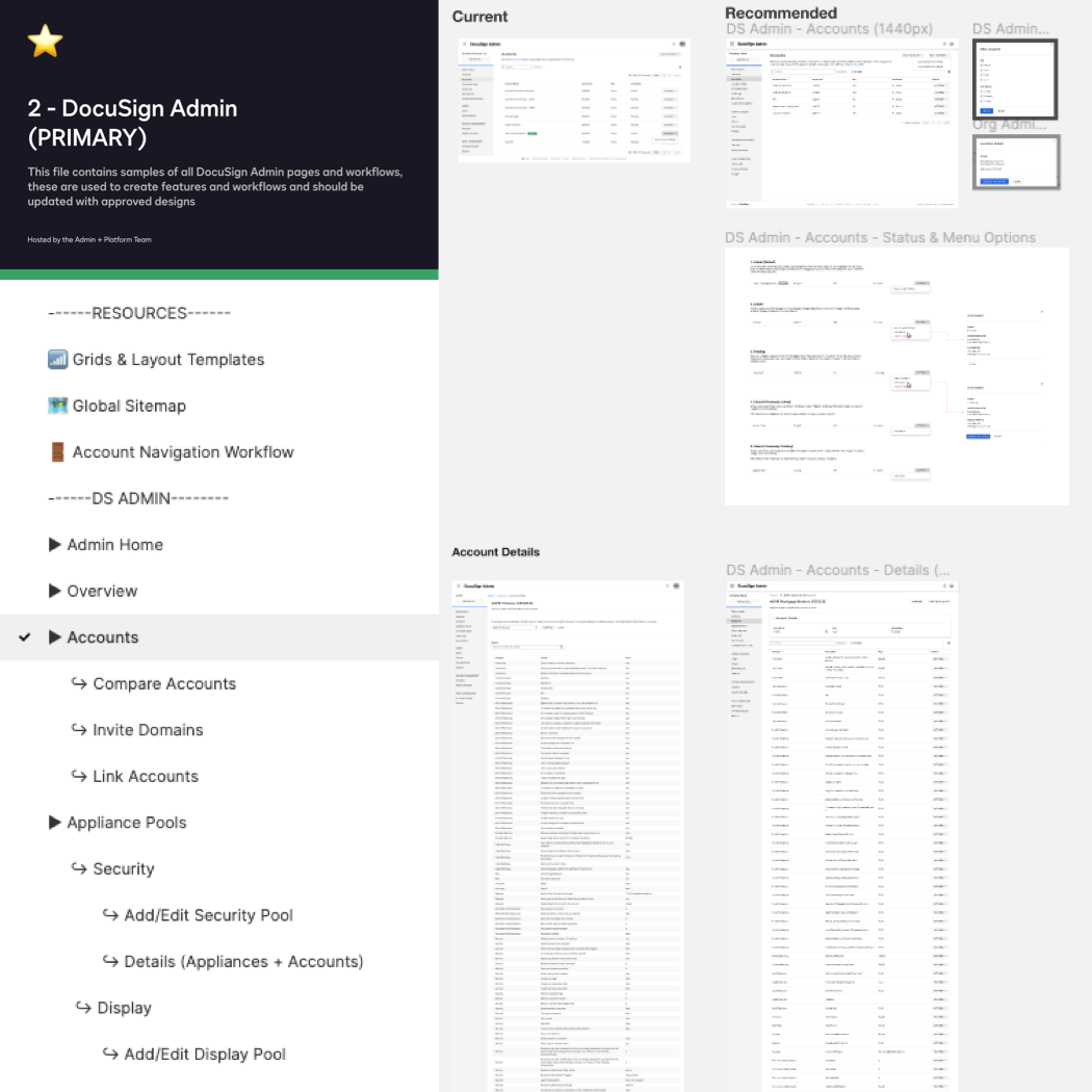
Because the Product File reflects the product itself, we use the site’s architecture to guide the structure of the file itself. These files are essential for inventory and can be a foundation for organizational change like upgrading to a new design library, migrating to a new design tool, or auditing.
Instead of hunting across live products and dozens of Abstract projects for existing patterns, the toolkit has provided a quick way to discover current versions of our components and specific details about how and when to use them, ultimately helping me achieve design consistency very quickly.
-Christa Louks, DocuSign Product Designer
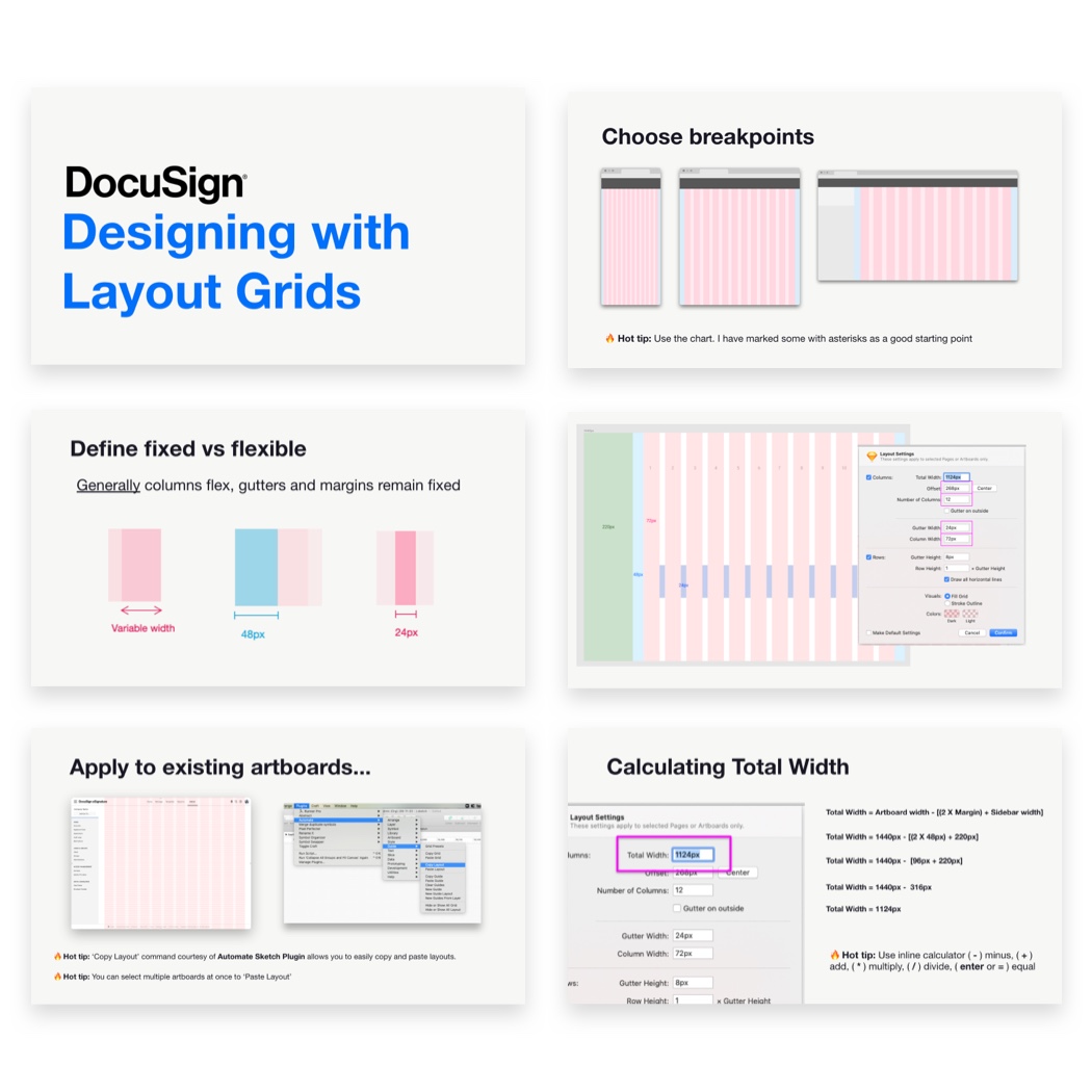
I tested them in the page template and product file as we defined components. The layouts we defined earlier come in handy. Ensuring patterns work for all device widths and layout constraints make them increasingly future-proof.
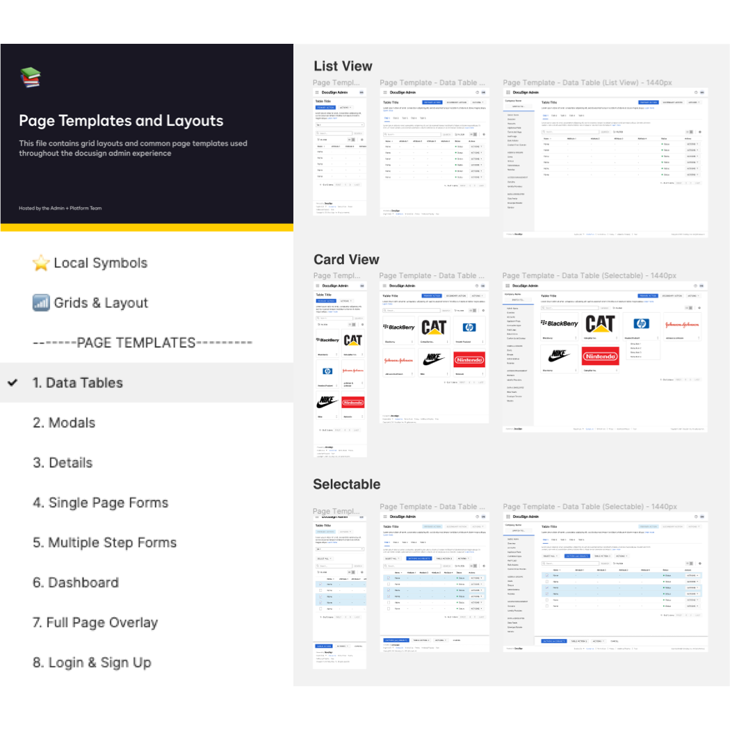
Like the components, page templates followed a similar inventory process, identifying which product most uses page types. We created 10 unique page templates and continue to add more as we start to venture into dashboards. It's worth mentioning these are universal and work for DocuSign or eSignature Admin and hopefully other Admin products in the Agreement Cloud landscape.
Having well-organized templates with various device widths helps facilitate responsive behavior conversations and enables the team to target previously non-considered mobile use cases.
The project's primary goals were to improve team efficiency and product consistency. We wanted an objective way to quantify the time saved for team members' designs product pages.
Since completion, the admin product system influenced the design systems team’s delivery of components by highlighting gaps in the documentation, adopted as the standard format for several other admin spaces, and continues to expedite tool migrations and design system conversions.
We're all familiar with productivity multipliers; tools or techniques that allow us to do more in a day, multiplying our effort. Usually, I can 2x my effort with automation and fanatic discipline, but the Admin Toolkit is a 10x multiplier.
Days spent hunting down a neglected design system turn into minutes of drag-and-drop from the Admin Toolkit. I can mock up apps live while meeting with stakeholders.
-Dylan Has, DocuSign Lead Product Designer
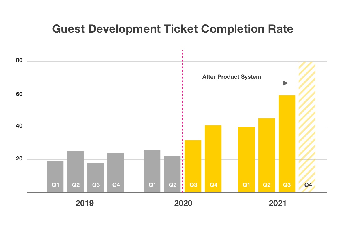
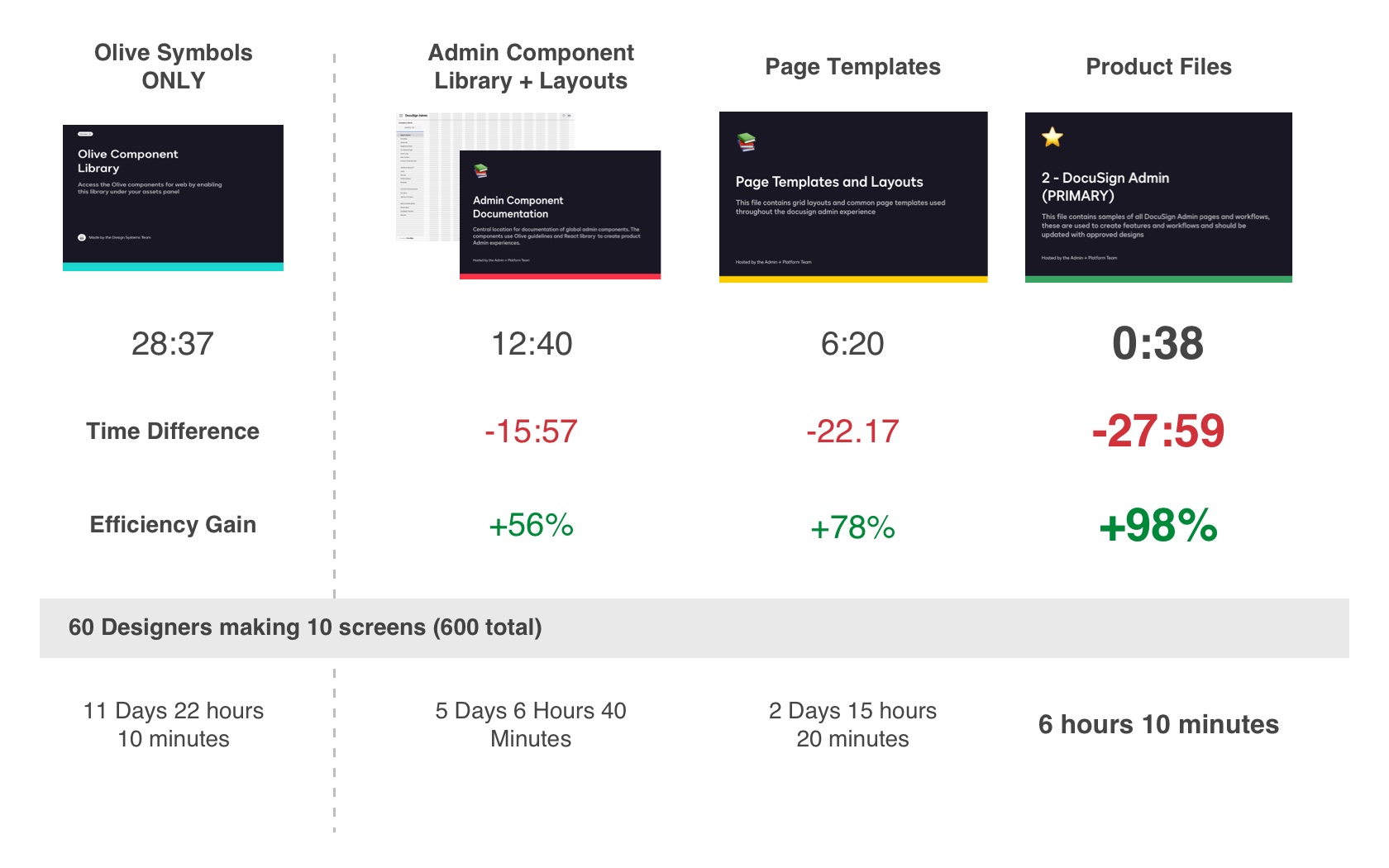
Before designers would have to search for a previous design file hoping that it was current and updated with the correct libraries, or more often than not rebuild using existing components. We decided to test how long it took to create the same page using different approaches with and without the product system.
A robust library of foundations, page templates, and PRIMARY product files containing every page instance ensured the team could quickly design for minor enhancements in addition to entirely new sections. We observed up to 98% efficiency gains when designers used the PRIMARY product files to copy and paste a particular artboard. Even creating a page from “scratch” using the improved shared libraries and documentation helped reduce time on task by half.
The success of any system hinges on the ability for knowledge to be transferred. The second portion and ongoing effort have been spent teaching designers the techniques and frameworks we used to build the system.
I conducted ten 1-hour long sessions with teams across the organizations. The sessions introduce our workspace and resources to improve the guest design process and align the company’s admin experience.
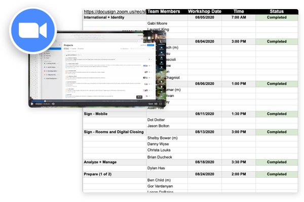
Each week the PX team (design and research) gets together to share knowledge and socialize. I gave several presentations focused on the foundations of our system in addition to a showcase of the first release.
As a new designer, the admin toolkit has been a huge help.The component documentation has been particularly useful as I've been learning more about how and where we use admin components.
-Michael Palmer, DocuSign Product Designer
The yearly week-long internal conference where DocuSign employees virtually connect by attending team member keynote presentations, participating in hackathons, and acknowledging one another through team awards. I was privileged to present our work to the broader organization showcasing our progress and results from the previous year.
Before designers would have to search for a previous design file hoping that it was current and updated with the correct libraries, or more often than not rebuild using existing components. We decided to test how long it took to create the same page using different approaches with and without the product system.
I was honored to introduce systems thinking to DocuSign's admin and platform team. I hope that the system will evolve to have distributed ownership in which team members can continue contributing to and sharing knowledge. Personally, design systems are a foundation on which I built my career, and I hope the product system will present newcomers with an opportunity to learn about our products and confidently contribute new features.