Loading

Dive into an extensive information architecture exploration, mapped across every level of Cloudflare's dashboard to yield a navigation structure resilient enough to absorb years of continued product growth.
Cloudflare's product catalog scaled exponentially over the years, but the primary means to traverse it — the dashboard navigation — failed to grow with it. Customers described it as "cluttered," "inconsistent," "unintuitive." The root problem resided in the lack of centralized governance over the surface, which led every internal product group to fight for prime real estate at the top. Without a shared model to mediate that competition, the UI surface quickly became an unorganized product directory rather than a cohesive experience.
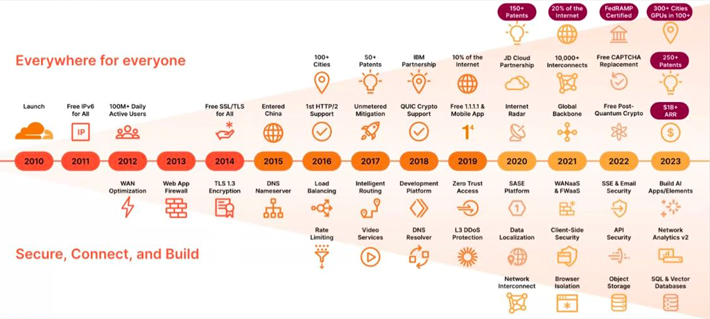
My mandate was to lead a strategic initiative to shift the navigational surface from a rigid, legacy domain-centered structure to an intent- and resource-focused structure. The new structure was intended to prioritize customer needs and scale with Cloudflare's product offerings.
What started as a request to investigate and redesign the Side Navigation, Top Navigation, and Footer quickly revealed a wide range of dependencies, including internal page navigation such as tabs and breadcrumbs, as well as the general underlying page template architecture. All elements had to be rebuilt in tandem while being implemented by multiple teams.
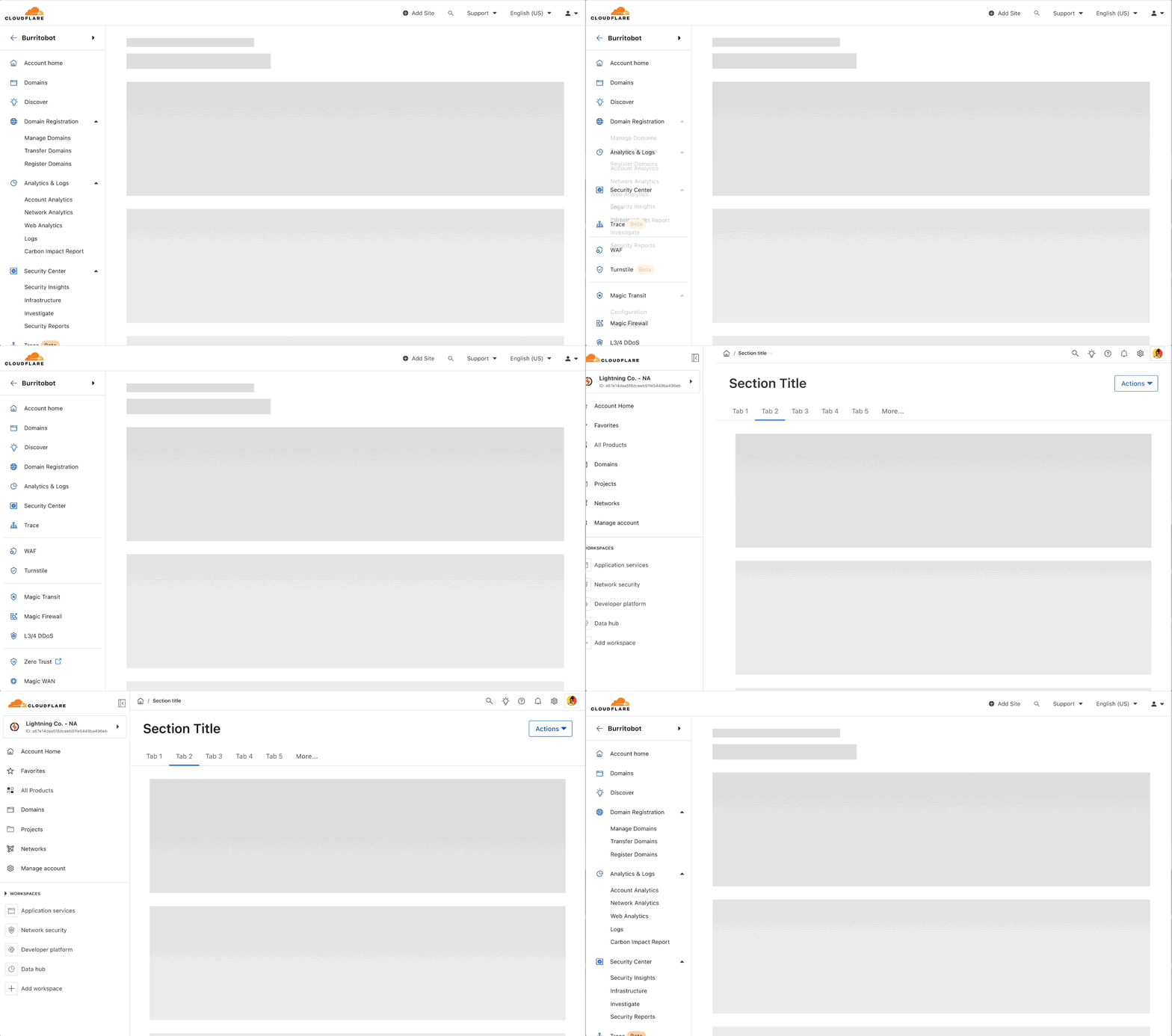
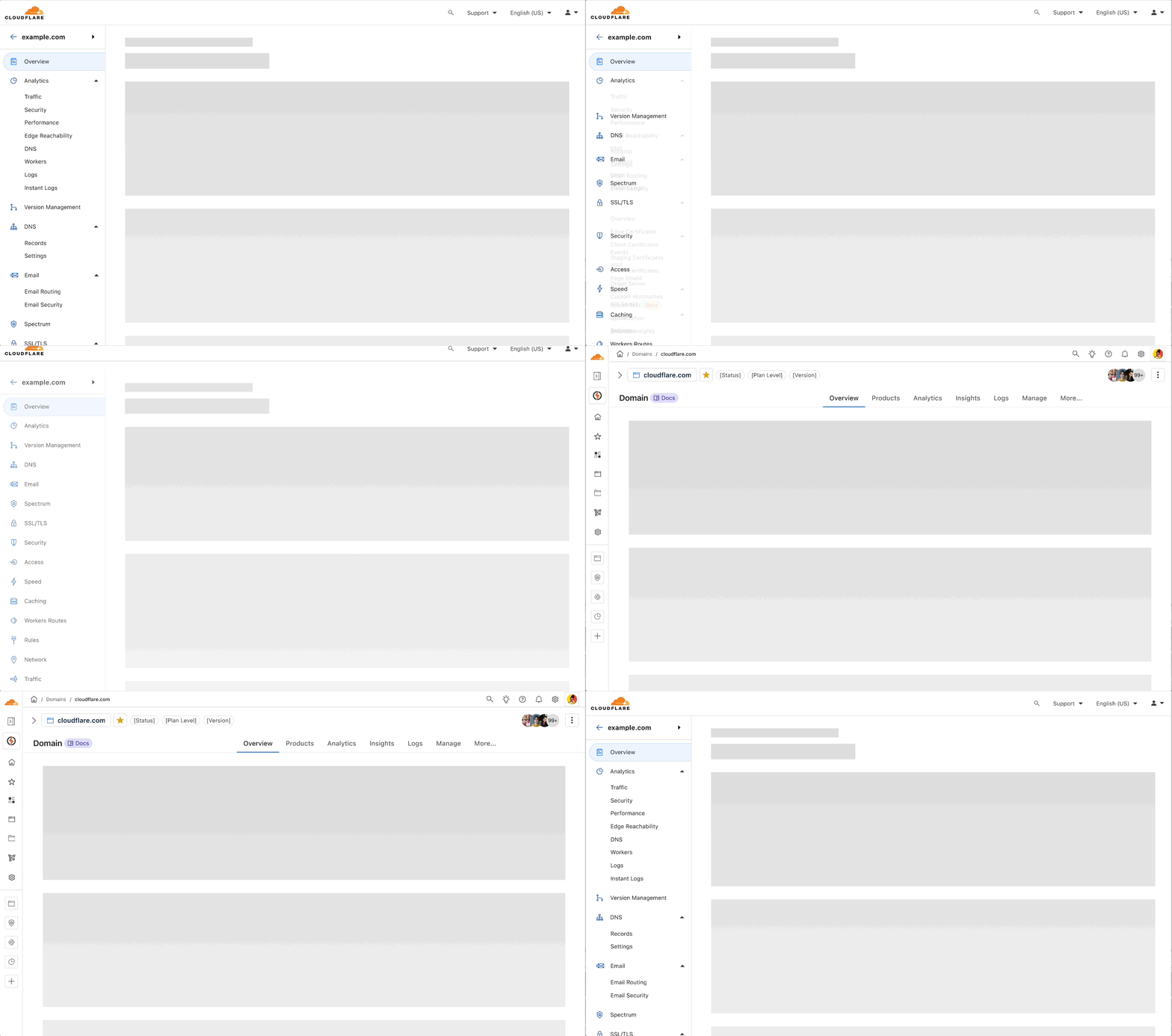
I owned the end-to-end IA strategy for this initiative: competitive and heuristic analysis, object modeling, wireframes through production-ready specs, and rolling research were all activated to achieve the team's goals.
Working on a highly visible, long-term project meant navigating through three successive product managers, carrying the work through multiple enterprise reorganizations, and translating decisions across three design system versions as the underlying platform changed beneath the project.

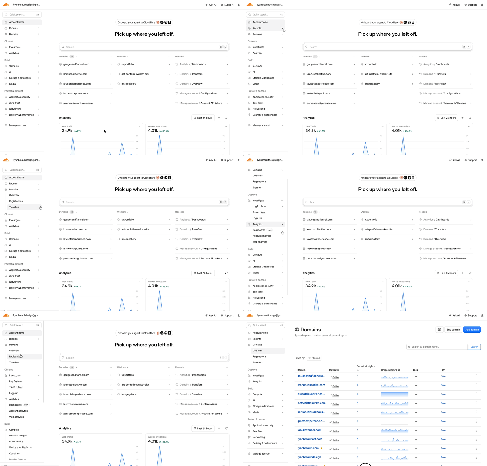
The project was unique in that there was no dedicated PM at the beginning. The initiative was assigned to myself and a content strategist, with the assignment: "make the nav better." We were given full autonomy to investigate and define what that meant and propose a better path forward.
By the time this work started, Cloudflare's product organization spanned seven separate groups, each shipping into the same navigation surface without a shared model for where a new product belonged.
| Phase | What Shipped | Status |
|---|---|---|
| Phase I: Global Navigation Initiative (2023 Q3) | Foundational strategy and blueprint | Design only |
| Phase II: Global Nav Partial | Footer + Top Nav only | Shipped |
| Phase III: Global Nav Beta | Added Side Navigation | Shipped |
| Phase IV: Global Navigation GA | Kumo design system migration | Shipped |
Phase II tried to ship the navigation piecemeal (Top Nav and Footer only) while the full structure was still circulating for consensus. That partial approach landed poorly due to an obvious structural mismatch, which is what ultimately forced the team to overhaul the architecture as a whole system rather than let it keep drifting. Phase IV's migration to Kumo gave the structure its final, polished state.
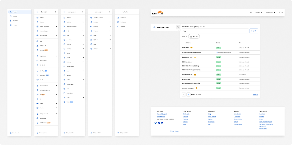
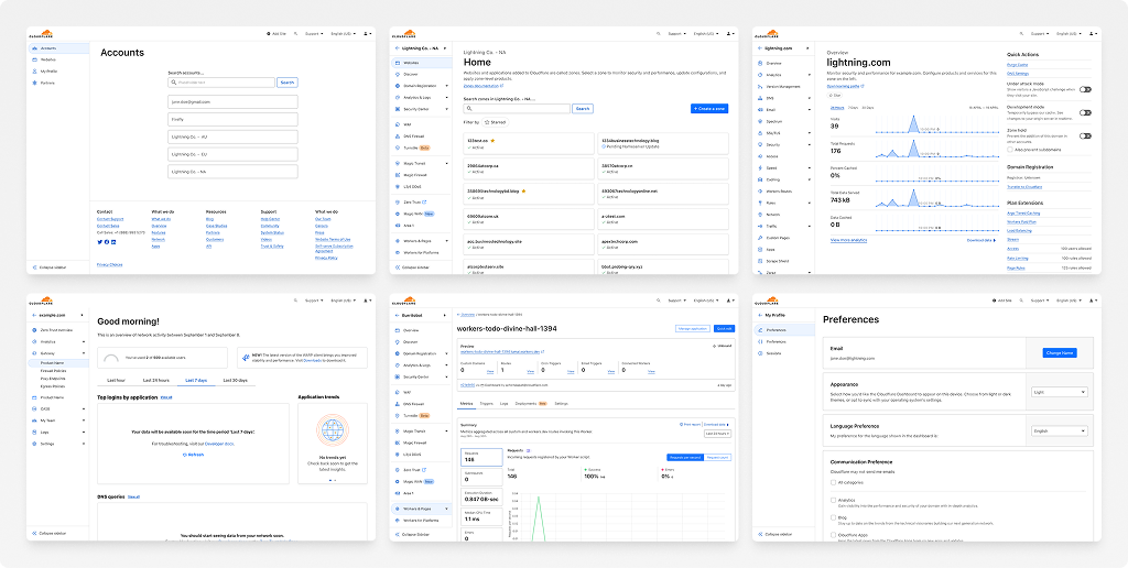
I approached this as an IA problem first. I needed to understand every existing page and object in the dashboard, model how they actually relate to each other, then design a navigation structure flexible enough to represent that model at any scale.
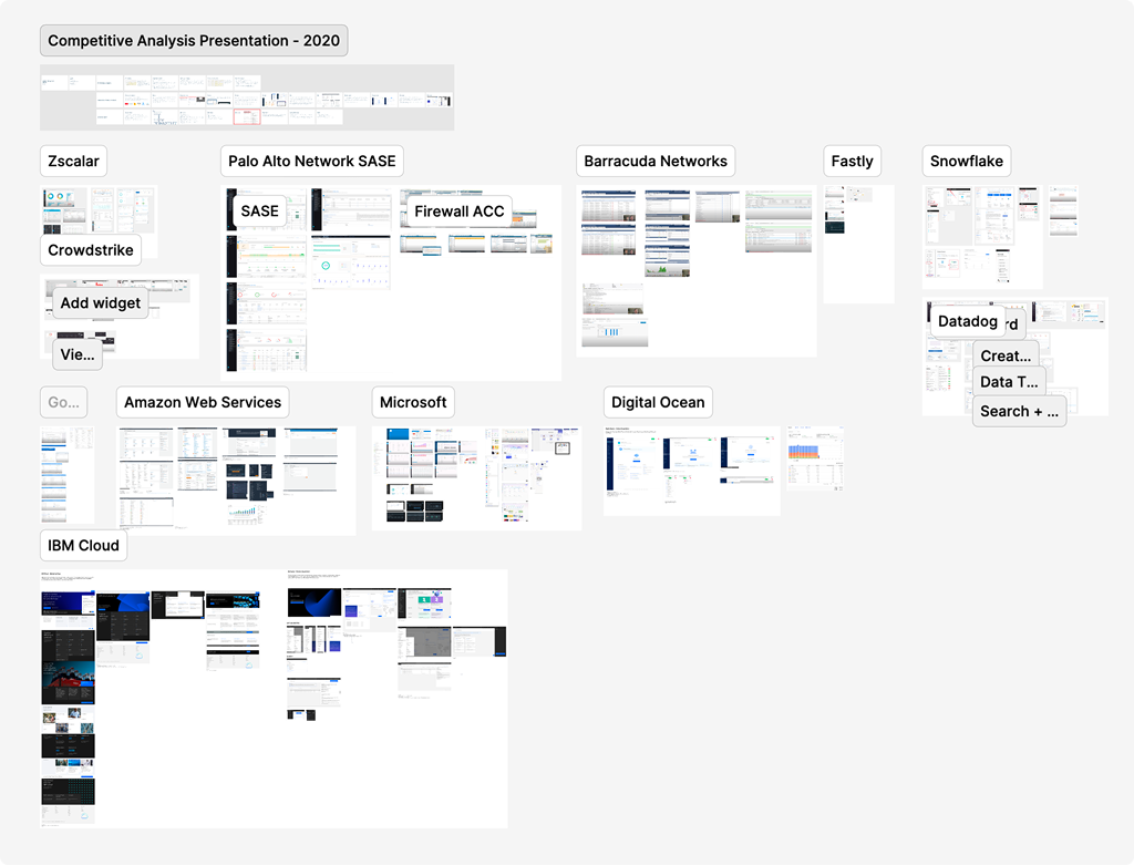
I benchmarked navigation and dashboard patterns against ten enterprise platforms, including Zscaler, Palo Alto Networks SASE, AWS, Google Cloud, and Microsoft — signing up for internal test accounts on many of them just to retrieve screenshots of flows otherwise hidden behind a sales call. That work established foundational principles before designing Cloudflare's own structure.
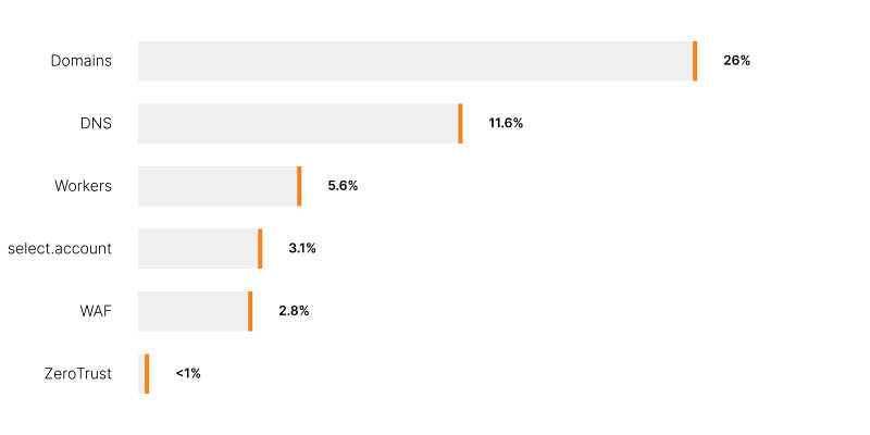
To help understand navigation patterns, I analyzed behavioral data from Amplitude to rank the dashboard's most-visited pages and workflows, grounding navigation priorities in real usage rather than stakeholder opinion. The most alarming pattern was a clear correlation between the position of a nav item and its number of visits. We noticed click-through funnels where new customers blindly clicked from one nav item to the next to explore — an indication of failure in naming and wayfinding.
To validate the IA itself, I ran a moderated card sort testing how customers actually expected products and navigation items to be grouped. When users were presented with variations of groups — by product, by intent, and by task — there was marginal success between each. We found that different customer segments required different groupings, which made it difficult to determine a single labeling scheme. The best-understood representation turned out to be one already validated elsewhere: the structure our developer docs had been using all along.
It's worth noting that this phase predated any AI tooling on the project, so all processes were entirely manual. New tooling was introduced in later phases to assist with implementation.
We found the greatest success by adopting object-oriented UX principles. As a team, we had to start thinking about what objects — and their respective data — were being manipulated, and how they related to other objects in the system. This revealed a more "relative" mindset to the interface that shattered the previous "place everything in a bucket" attitude. We defined every facet of the existing and aspirational object within the dashboard:
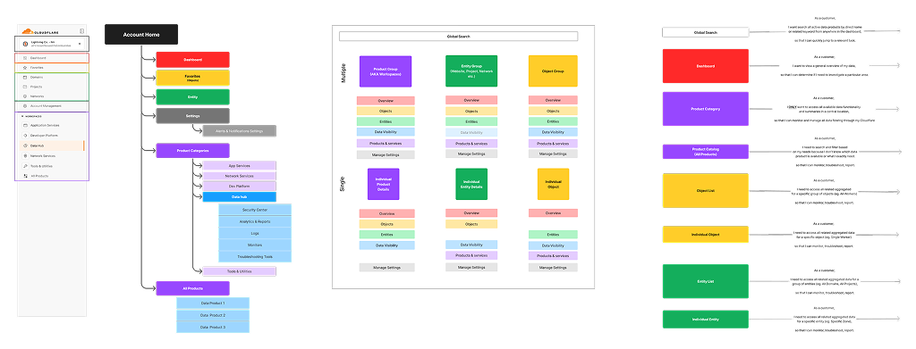
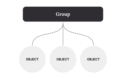
The system needed to scale from one object to many, representing both the group and the individual entities within it, without needing a redesign every time a new product launched. It also needed the ability to group different categories of objects together. I mapped the platform's recurring aggregate-to-component relationships to make that concrete:
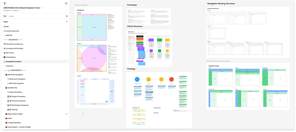
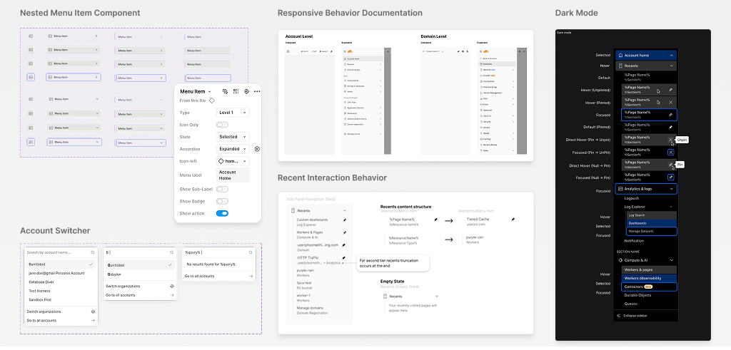
Exploration was primarily conducted in Figma. All explorations, foundations, and prototypes were collected and tracked within the file. As AI tooling became available, I began prototyping directly in code, pulling reference images from the file. I also owned our central shared component library — up-to-date navigation components, previously non-existent, were maintained and shared directly from that file along with finalized behavior and interaction documentation. This approach allowed for an isolated sandbox environment without introducing some of the more exploratory solutions.
We designed and anchored structural decisions to four intent-based principles:
| Category | Metric | Objective |
|---|---|---|
| User Engagement | Cross-Product Navigation | Match or exceed Account Home's baseline 2.4% growth |
| Time to Discover | Decrease seconds to locate deeply nested sub-nav items | |
| Global Search Optimization | Increase successful search, reduce abandonment | |
| Product Adoption | Onboarding Velocity from Signup | Accelerate cross-product adoption |
| Usability & Cognitive Load | Multi-Account Task Success | Reduce navigation steps |
| Technical Scalability | Component & Template Reuse Rate | Consolidate libraries and improve design consistency |
| Front-End QA Efficiency | Reduce visual validation and eng/design cycles | |
| Mobile-First Menu Interaction | Achieve growth in responsive menu adoption |
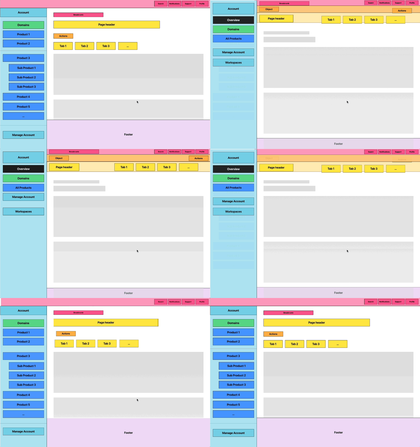
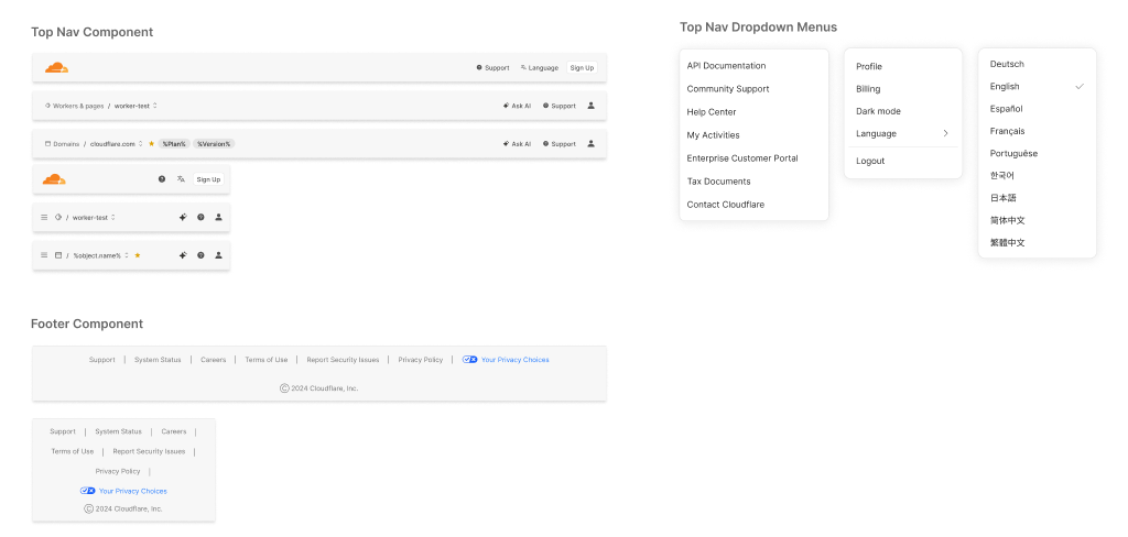
Consolidating these levels conserved vertical space and introduced a contextual breadcrumb to solve the "where am I, and what am I operating on?" problem the legacy structure had never answered.
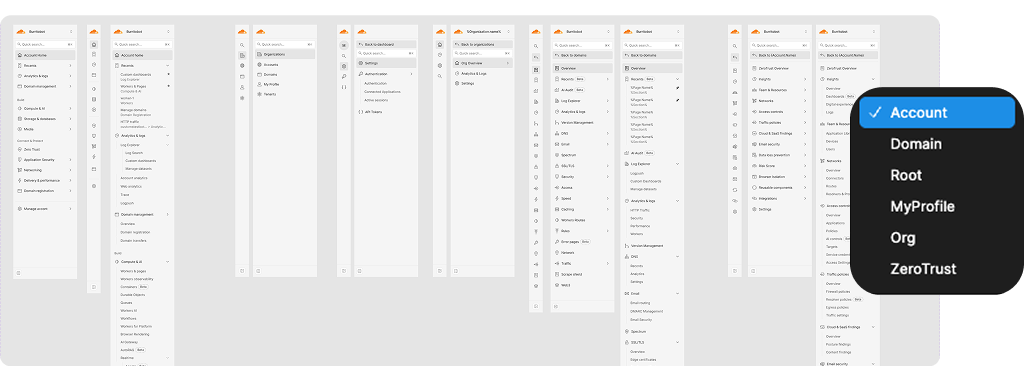
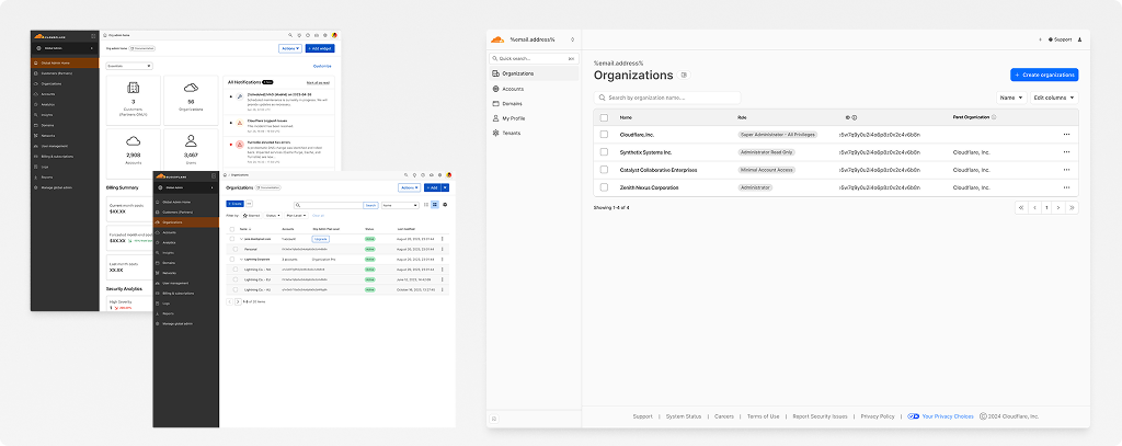
The proposal for the new UI was partially adopted. Certain product areas, such as Zero Trust, were more readily able to adopt the intent-based structure due to their product being built in a separate code base, accessed from the primary account surface. Greenfield spaces, such as Organizations, were able to adopt the object-oriented structure immediately. Legacy spaces, such as the domain details nav, required greater consolidation and migration of nav items to internal pages before being fully integrated.
Regardless of stage, all navigation and object pages began turning in the same direction, and continual iteration slowly drove the navigation to a consistent structure.
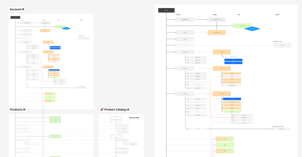
The overview pages were designed as an extension of the navigation itself. Rather than asking customers to dig through a heavy side panel to find what they needed, each overview page exposed the underlying data architecture directly, surfacing the right destinations up front instead of burying them in nested navigation. Combined with improving search capability, this lowered the reliance on the side panel itself.
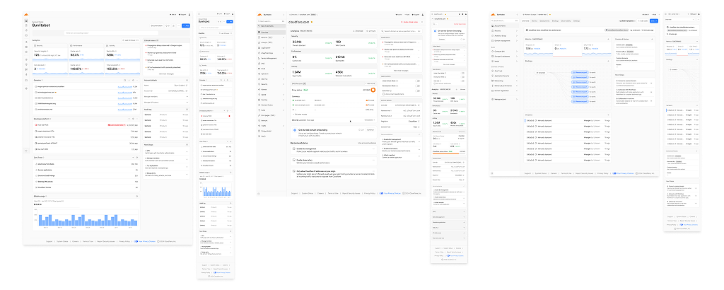
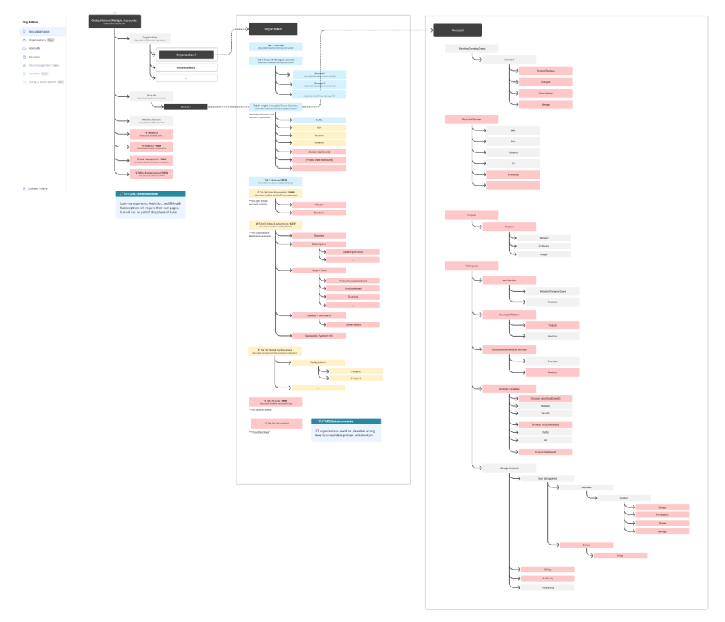
This is the core of what made the structure resilient: the same object model and the same page template scaled from a single domain up to a global admin view of dozens of organizations, without needing a new pattern at each level.
I mapped the full product catalog against category, plan tier, and tag dimensions, building the inventory needed to mock up the target experience and track existing products against proposed site diagrams as the catalog kept growing.
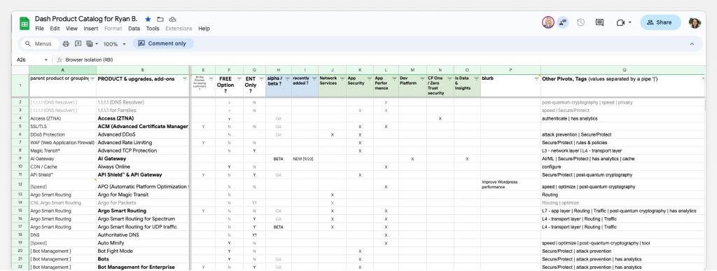
Products were "unofficially" segmented by product team, but the category boundaries overlapped enough that an explicit taxonomy was hard to defend, especially once the system was oriented around a specific object like a domain, where categories got lumped together without highlighting intent or the individual product itself.
Some products legitimately belonged to multiple categories at once, which meant a customer might have to traverse an unrelated part of the dashboard just to change a setting that impacted a dependent object elsewhere.
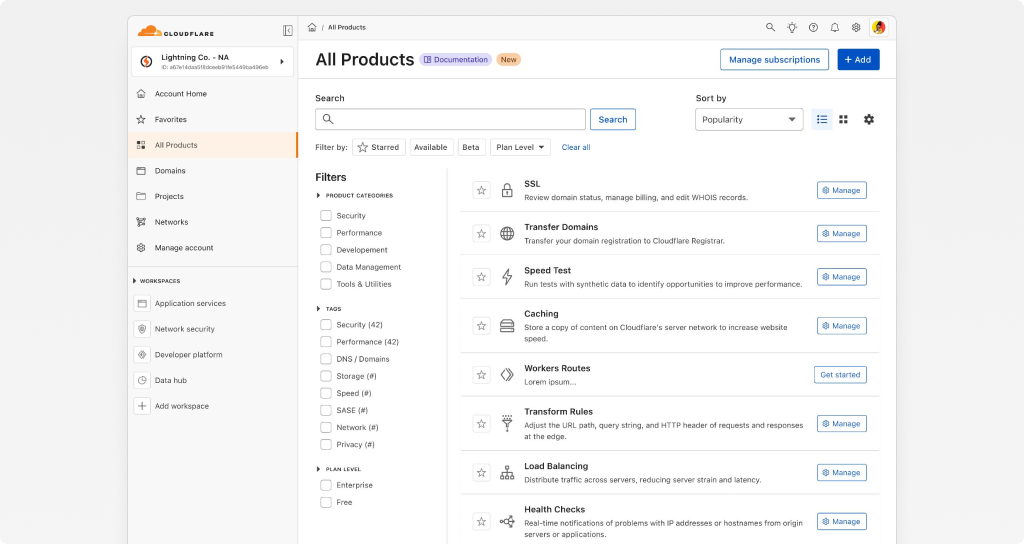
The fix was to treat category as a tag rather than a fixed container: products and features tagged by intent, description, and keywords, so the catalog behaves like a workspace holding a mix of products regardless of internal classification. That is the design decision that let the catalog keep growing without the navigation growing brittle alongside it, and it wasn't unprecedented — the developer docs site, which I'd also worked on revamping, already categorized products this way successfully. We were able to absorb this into search but lacked the proposed product catalog I envisioned, one that would have lent itself to greater developer documentation integration and a more additive approach to building resources and their connected services.
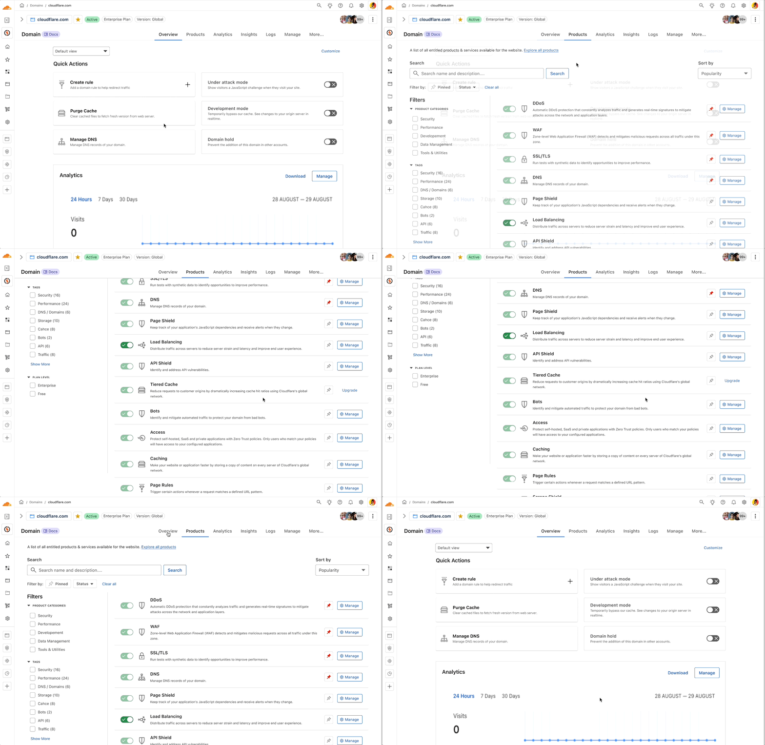
A handful of specific calls, made under my direction, were highly influential in keeping the navigation experience on a positive trajectory.
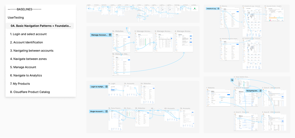
I mapped the workflows that best represented customers' navigation pain points and took them into moderated testing, instrumented with UserTesting, focused on traversing the dashboard between accounts and navigating to product areas that had historically suffered from poor discovery. Those baselines directly informed multiple rounds of follow-up experimentation before the structure shipped.
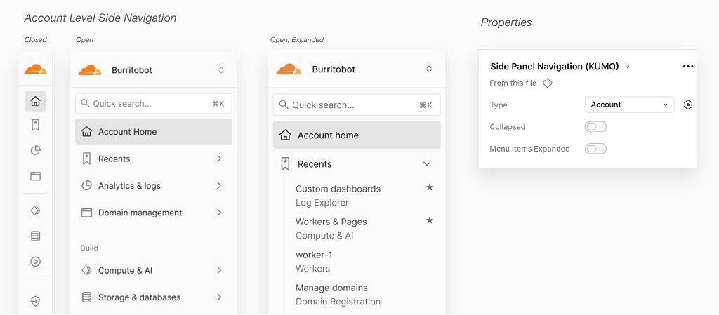
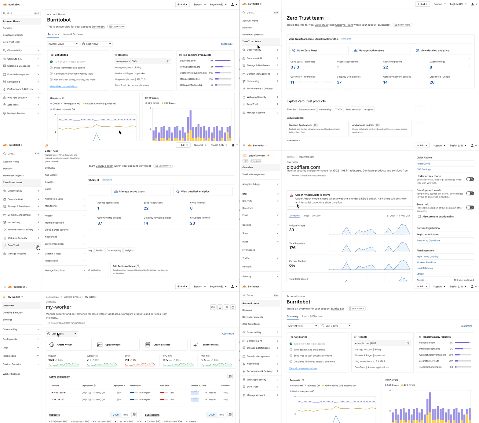
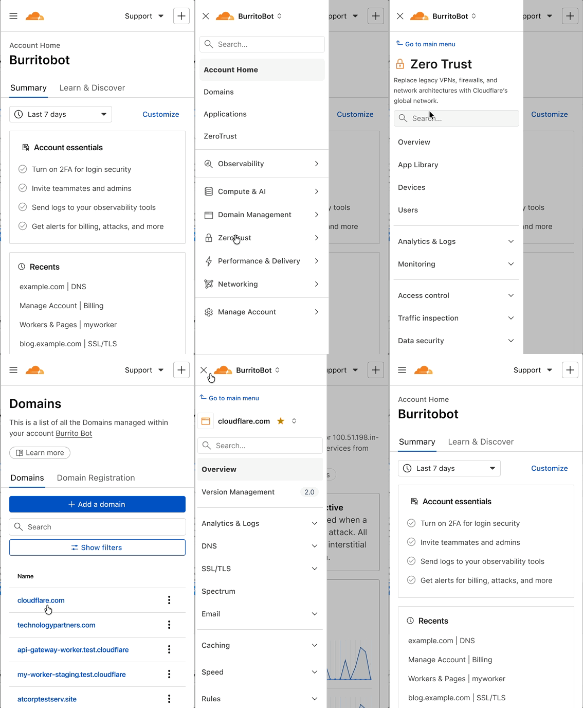
The new navigation shipped across the highest-traffic surfaces first. It was validated through moderated card-sort testing and phased against the object model defined earlier. Adoption is still uneven across product areas. That was a deliberate trade-off to avoid a disruptive, all-at-once migration. The architecture is now resilient enough to absorb new products without another IA rebuild.
One artifact I built was a single prototype covering every major area of the dashboard, from the Organization level down to the individual Object level. Having the whole system in one connected view let me surface platform features that were missing entirely, and stress-test the object model against pages that didn't exist yet, not just the ones already live. That prototype became the reference I leaned on for the rest of the project, any time a new product needed a home or an existing area needed revisiting.
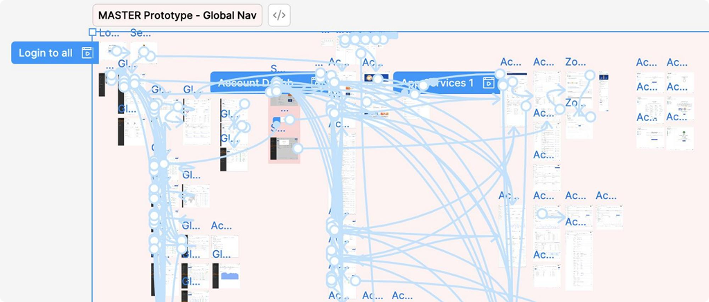
That same exploration extended into a reusable component system: a full Side Panel navigation library, a slot-based Dynamic Page Header for consistent object metadata and actions across every page type, and centralized page templates — so that new product areas could be built on the existing structure instead of inventing a new pattern each time.
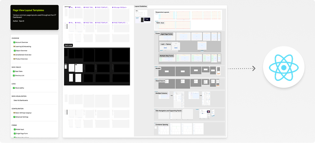
The deep exploration of dashboard structure allowed me to create an extensive library of page templates. These templates were maintained by myself until late 2025, when AI tooling became available and I established a secondary library connected to our central design system — letting designers copy a markdown file to quickly convert pages to a consistent layout and structure.
The inability to implement a true "workspace" provided the foundational context to pursue a resource tagging feature. The feature allowed all accessible resources within an account to be assigned a key and value, creating a comprehensive list of objects that could be sorted and filtered by tag attribute for billing, project, and search purposes. It attempted to connect several disparate tagging systems while providing a blueprint for other resources to adopt.
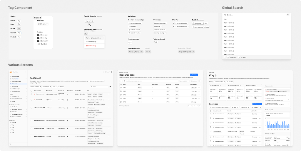
The navigation project and its artifacts provided the first tangible view of how organizations and multi-account customers maneuver between organizations, accounts, and resources. Many of the original solutions have since been implemented and continue to steer the product toward a scalable Cloudflare system.
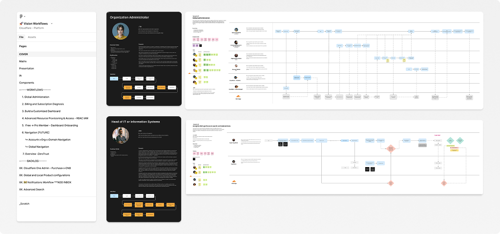
While navigation was the primary focus of the initiative, experimenting with the content level of each section was critical to determining a durable structure that could absorb the future of organizations and their administration. I used Figma to map out several future-facing features — including custom dashboards, billing overage diagnosis, and organization onboarding. The resulting personas, scenario maps, and prototypes continued to provide valuable reference for myself and the team members assigned to these areas in the years that followed.
Every level of the dashboard, from a single domain to a global admin view, ended up running on the same underlying object model and page template. That's the reason the structure could absorb new products without a redesign each time; the IA work up front did the job it was supposed to do.
The structure that shipped wasn't the first version proposed. It was the one that survived enough iteration, and enough organizational change, to actually launch. Because engineers understood the research and rationale behind it, they carried that reasoning into rooms I wasn't in.
Comprehensive visual reference and design documentation made every later phase faster, not just for handoff, but as the reference material for how new product areas should be modeled against the existing structure.
Many of the navigation issues were not solved by navigation UI, but rather by page content and search. Having an open initiative like "make the nav better" gave us the ability to expand the solution beyond the UI surface.
Working on global navigation meant inventorying and understanding the entire Cloudflare product system: every surface, every team, every inconsistency. That system-level fluency became the real unlock for what came next. When I moved into Account Home and other overview surfaces, I already had the map. I get real energy from seeing the whole ecosystem at once, then bringing that knowledge back down into a specific, focused area. This project is the clearest example of that pattern in my career so far.
The hardest part wasn't the design itself. It was the unevenness. Different product spaces were at wildly different levels of maturity, and progress across teams was asymmetrical in ways that couldn't be forced into a single timeline. Leading structural work at this scale meant learning to be patient, flexible, and opportunistic — knowing when to push, when to wait, and how to source the right designers and partners team by team rather than expecting a uniform rollout. I used office hours to review work in progress and stay close to execution, and group presentations to keep the broader org aware of where the project stood and why it mattered.
One thing I'm particularly proud of is this: the initial proposal didn't have access to the new design system UI, so much of it was necessarily a statement of future vision — a bet on what the navigation could become. When we finally got access to the new system, the pieces came together fast, because the underlying structure had already been solidified and proven out. The vision didn't need to be reinvented once the tools caught up. It just needed to be built and polished.
Related work: Cloudflare Account Home Dashboard Case Study →