Loading

A career-long through line in design systems contribution — from early foundations at Sabre and JCPenney, to a component library at AWS, to leading a company-wide product system at Docusign, to shaping component architecture and data visualization at enterprise scale at Cloudflare.
Every product designer encounters inconsistency when working on a product. Maybe it's a button that looks different on every screen, a form pattern reinvented by three different teams, or a color that shows up in seventeen slightly different shades. Most designers notice it once, patch the one component, and move on. I have a different philosophy: fix the problem at the source, and you never have to answer the same question twice.
Across four companies and 10+ years, the thread connecting my most meaningful work has been the same — taking a fragmented, ad hoc product experience and building the shared language of components, patterns, tokens, documentation, and the human processes around them, so organizations can move faster without losing coherence.
Each engagement raised the stakes: from a single retailer's foundations library, to a UX contribution on an enterprise SaaS design system, to a component library that gave a consulting team rapid prototyping speed at AWS, to owning a product system end-to-end, to operating inside one of the most technically demanding internet infrastructure companies in the industry.
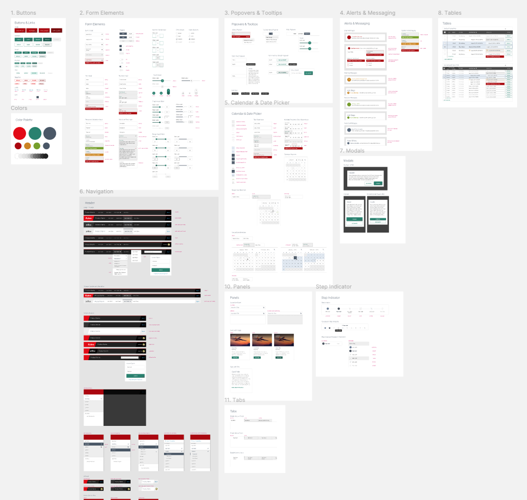
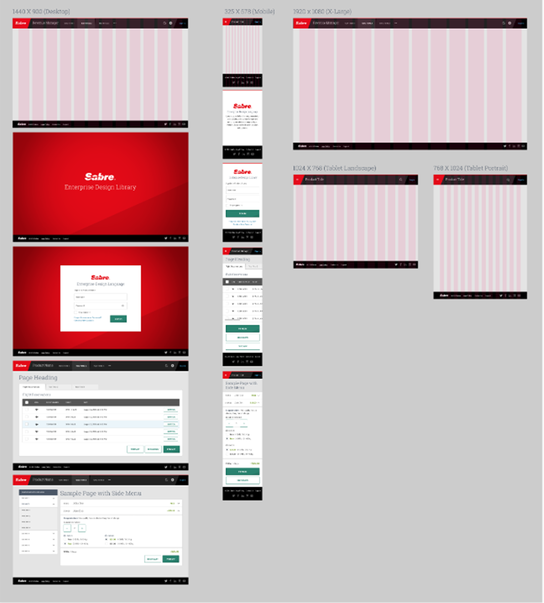
While consulting for Texas-based projekt202, I worked as a UX designer on Spark, a design system built for Sabre, a travel technology company powering booking and reservation systems for airlines, hotels, and travel agencies globally.
This was my earliest exposure to design systems work in a B2B, high-complexity domain. Travel and reservation software lent itself to high density, expansive edge cases, and enterprise-level workflows.
The system was designed entirely in Photoshop, predating modern design tools like Figma. Working within that legacy software forced me to internalize clarity in documentation and flexibility in output — a context that shaped how I'd later approach systems work at Docusign and Cloudflare, both of which share that same enterprise complexity.
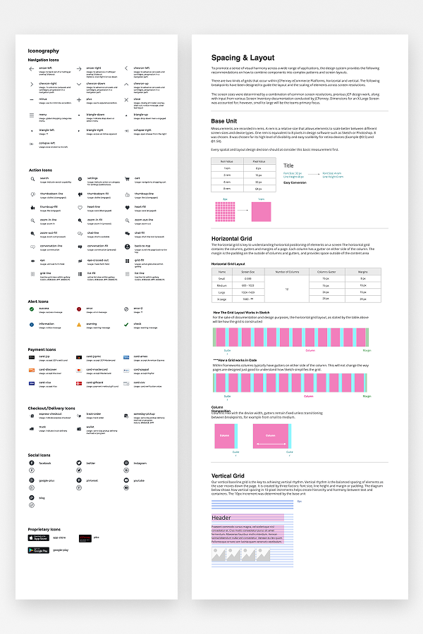
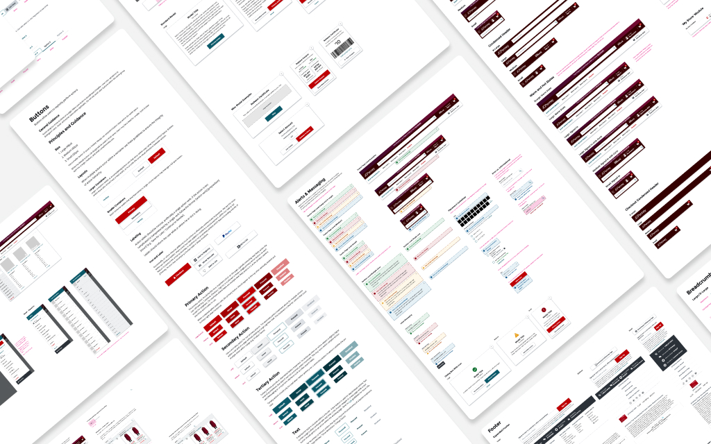
Soon after, I was assigned to lead the effort to define JCPenney's first modern design system. Graduating to Sketch, I consolidated a fragmented set of design files and undocumented patterns into shared foundations, components, and page templates for the eCommerce team.
That work is documented in full as its own case study, including the heuristic evaluation and style inventory that surfaced the problem, the foundations/components/templates structure we built, and the grassroots adoption strategy that got it into designers' hands.
Read the full JCPenney Lincoln Design System case study →
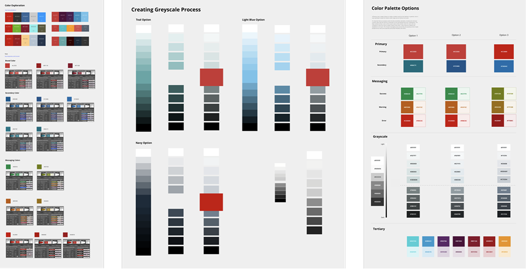
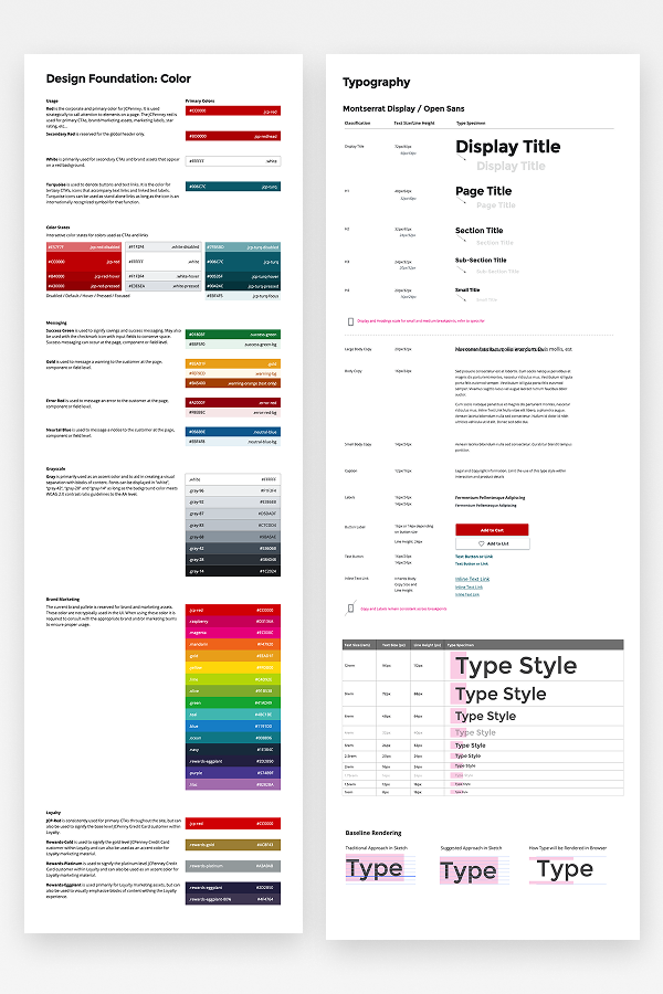
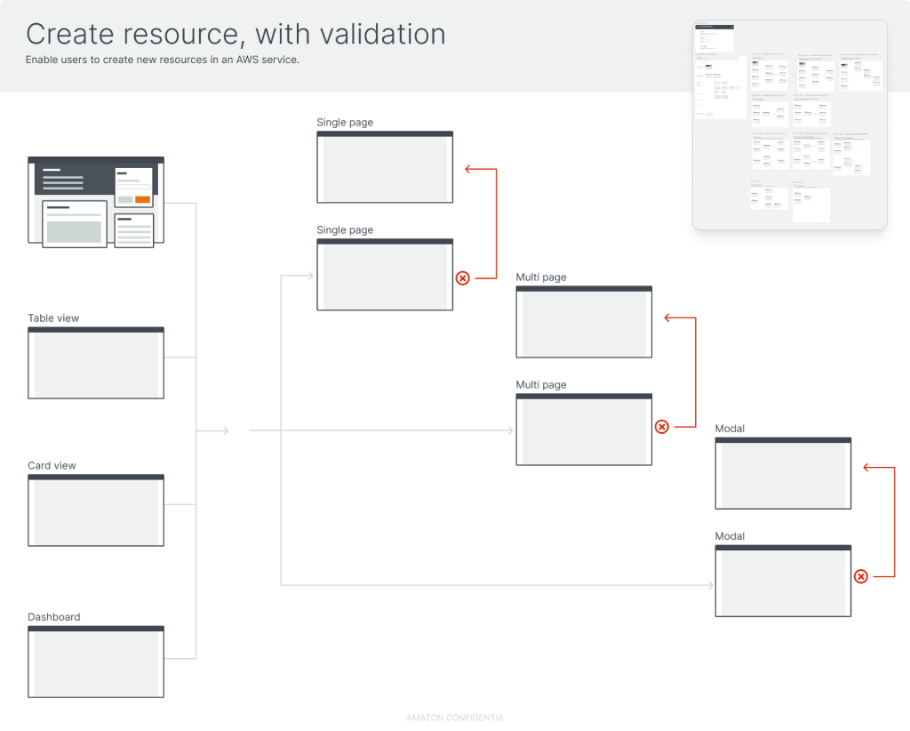
Towards the end of my consulting era, I had the privilege of working within the AWS organization at Amazon. I was the first designer on the engagement after our company had difficulty establishing a stable program, and I identified the need to improve onboarding to new projects to differentiate ourselves as a vendor.
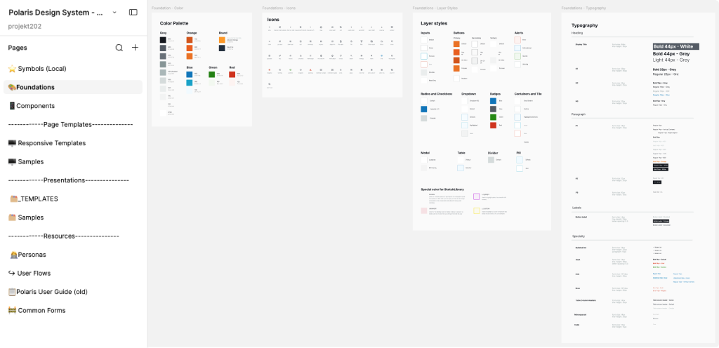
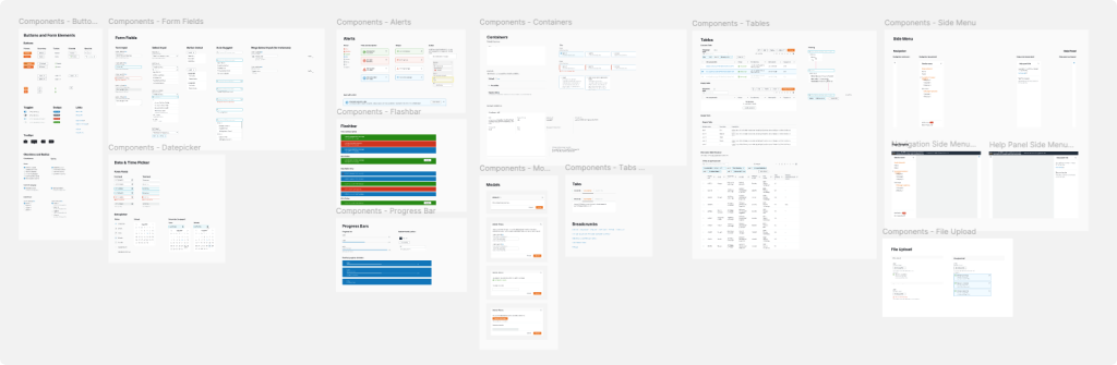
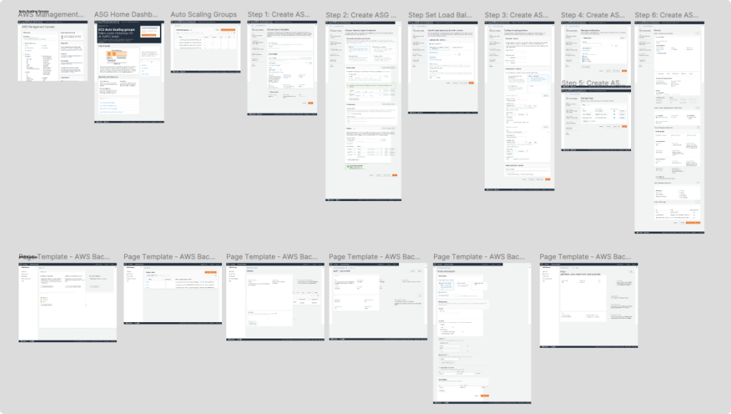
Upon arrival, the team shared a legacy Sketch file for Polaris. Unfortunately, the file was severely outdated against the current product and lacked sufficient foundations and page templates — and our entire team was actively working in Figma. There was no automated path between the two; the AI-assisted migration tooling that exists today (auto-converting Sketch libraries into Figma, generating components from code) simply didn't exist yet. So I manually rebuilt the library from the ground up in Figma, establishing the foundations and page templates the legacy file was missing, and maintaining it throughout our engagement.
Having a properly foundational library helped establish credibility, leading to expansive design engagements — we grew from one to twelve designers on the AWS account consuming the library day-to-day. Before departing Amazon, I packaged the file and handed it off, and watched it become the blueprint for AWS's future design system in Figma.
It's a fitting close to the consulting chapter: even without the AI tooling that would later make this kind of migration fast, the underlying instinct was the same one I'd bring to Docusign and Cloudflare — consolidating and giving the team a shared source of truth to build from.
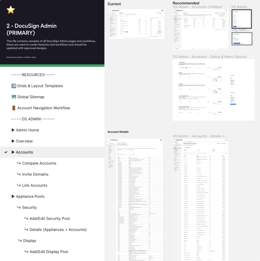
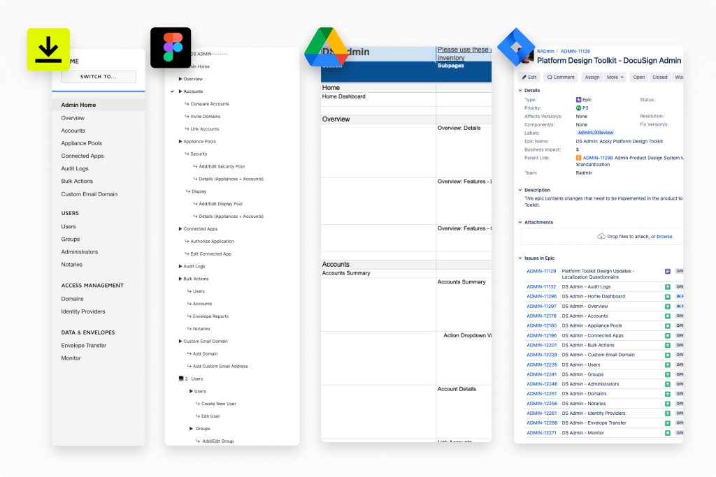
At Docusign, I led the creation of a Product System for the Admin and eSignature Settings experience. This layer sat between Docusign's central design system and individual product teams, translating general design system guidelines into the specific components, page templates, and documentation that dozens of designers and engineers relied on daily.
This is the project where I first formalized a lot of the process and education I'd later apply at Cloudflare — build the shared library and framework, then the governance that keeps it alive after the initial push.
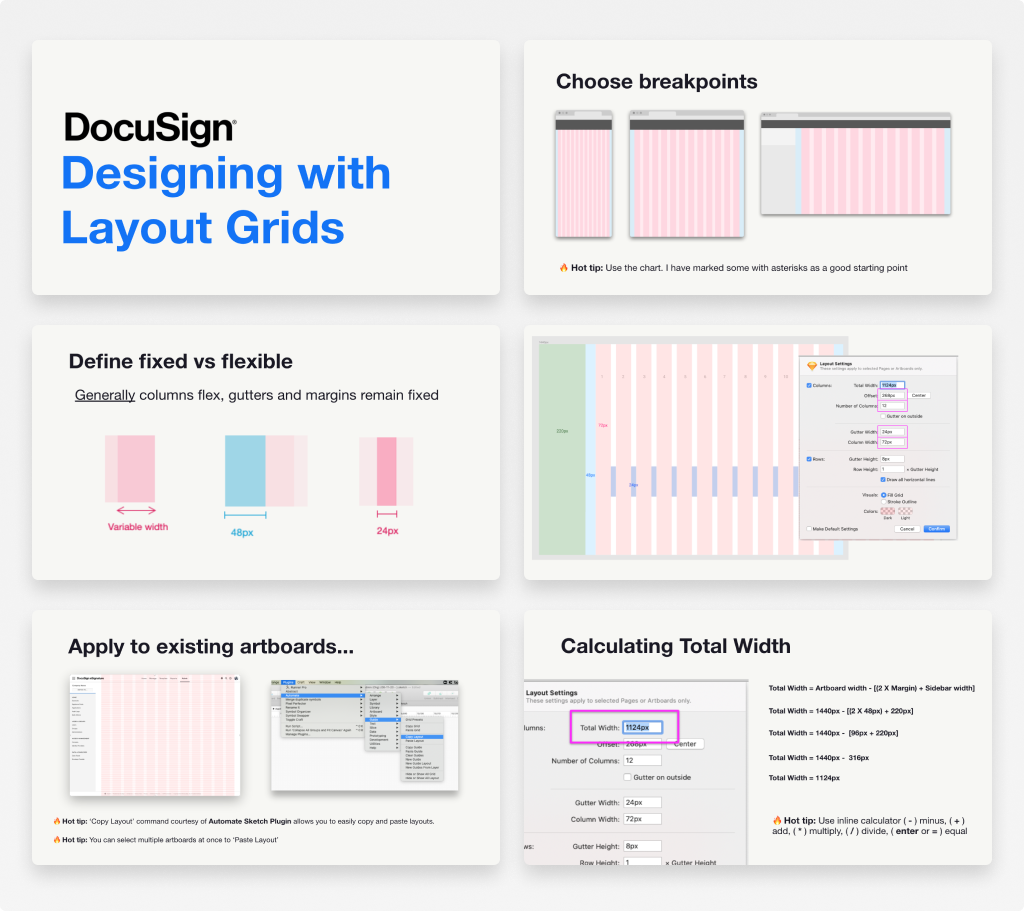
Read the full Docusign Product System case study →
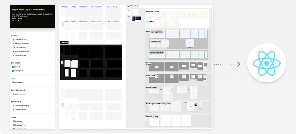
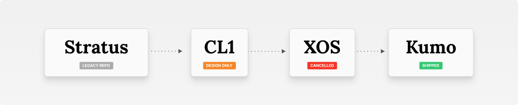
Cloudflare's product surface spans dozens of teams building on top of a shared dashboard experience. I joined at a point when the component library needed both expansion (new, more sophisticated patterns) and consolidation (bringing fragmented foundational styles into a single, shared source of truth). An interesting wrinkle: the expectation for design assets was evolving toward shipping to production directly in React via Storybook.
Cloudflare's UI had gone largely untouched for nearly eight years. Over that time, components had proliferated organically — teams would manipulate "atom" level components on a per-page basis rather than building on a shared foundation. There was no single source of truth or governance around contribution, no agreed-upon structure, and no clear path toward modernizing the visual style.
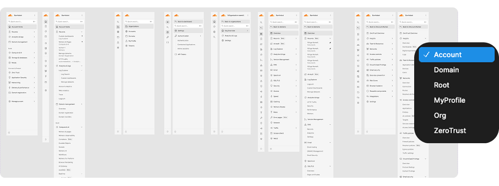
Before any aesthetic refresh could happen, the design org needed to answer a more fundamental question: what did the system even contain? The goal of the work was to create that inventory and future blueprint of components and page templates — making the existing interfaces legible, and laying the structural groundwork for a style overhaul.
I contributed a series of pattern-level components and full page templates to Cloudflare's shared React component library, documented and maintained in Storybook for consumption by both designers and engineers:
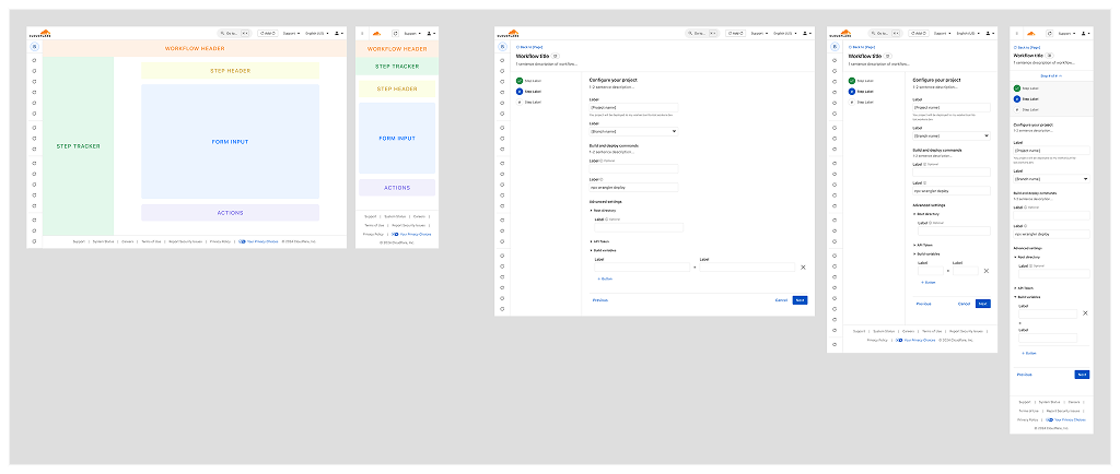
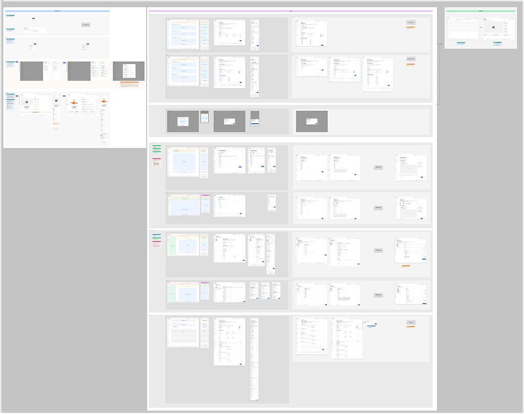
Beyond individual patterns, I contributed to the consolidation of Cloudflare's foundational design variables and styles into a single shared component library serving the design organization. Prior design files relied entirely on styles and had not adopted Figma's variable structure. Translating hex codes into the initial variable library allowed for adoption of tokens beyond color and opened up the opportunity for color theming.
This also meant designers across teams could build from the same palette as the engineers shipping the live product, closing the gap between what got designed and what got shipped — and helped put a stop to the question, "what hex color is the primary button?"
I also contributed to Cloudflare's data visualization library. I audited and catalogued the full range of data visualization UI across the existing system — chart types, traffic graphs, analytics displays — and translated everything into Figma to establish a sub-library within the primary shared file. That base library was later handed off to a design partner, who expanded it into its own standalone file in service of a custom dashboard feature being rolled out by the data team.
Data visualization is a notoriously hard category for design systems to standardize well, since it sits at the intersection of design, data, and engineering constraints. Contributing this UI extended the same systems thinking and challenged me to find new ways to expand ownership and compound value.
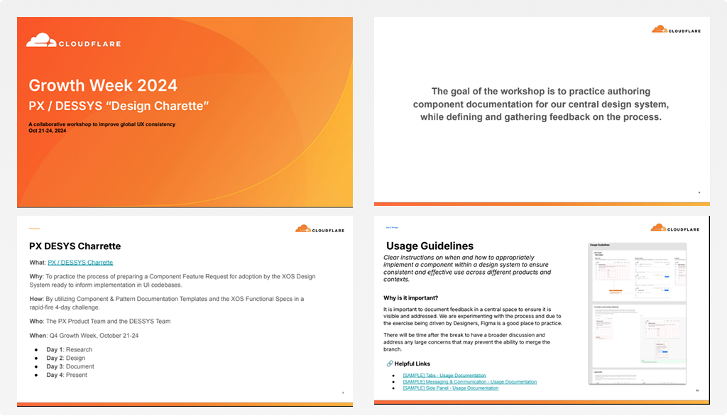
Knowledge transfer has been a constant across every system I've built, and Cloudflare was no exception. I hosted a 4-day collaborative Design Systems contribution workshop that brought together Cloudflare's PX Product Team and the Design Systems (DESSYS) team to practice the end-to-end process of proposing, designing, documenting, and presenting components for the XOS Design System.
We covered component audits, competitive research, Figma branching, design specifications (variants, anatomy, accessibility, interaction behavior, tokens), functional spec writing, and the library contribution/merge process.
Four cross-functional teams of three — a PX Design Lead, a DESSYS rep, and a Tiger Team product lead — each tackled a different component. The format was Research → Design → Document → Present, with breakout sessions, async work blocks, and a final presentation day where teams shared findings and received live feedback before merging files.
The workshop gave designers a crash course in system contribution and helped us define some of our most common yet highly variable UI components.
As the library matured, the challenge shifted from building it to keeping it healthy. I led a Tiger team responsible for the ongoing maintenance and upkeep of the design library artifacts. The team was made up of 4-6 designers with strengths in systems from different product areas, tasked with being ambassadors for their teams. Weekly meetings consisted of reviewing newly submitted patterns, fixing bugs and style discrepancies in the library, and defining missing components and patterns.
The effort was critical to continuing to support our product organization through an oncoming shift in system ownership and company structure.
Cloudflare stands out as one of the most successful examples of what happens when design systems investment compounds over time. Like the variables and foundations that make a design system structurally sound, the real multiplier is institutional knowledge — a team that deeply understands UI architecture, contribution models, and how system decisions ripple into product.
The workshop gave the PX team a deep understanding of the contribution process. Many team members used what they learned to progress into the next chapter of design-led systems work, leveraging AI tooling to propose, document, and ship components and patterns at a pace that wasn't previously possible.
The most direct outcome came near the end of my time at Cloudflare. Partnering with a Tiger Team member, we delivered page templates directly into the source code — approved Markdown files that product teams could copy and apply immediately to their own areas. This removed a significant friction point between design intent and implementation, accelerating adoption of the new UI system and giving designers, PMs, and engineers a faster path to high-fidelity prototyping without starting from scratch.
Looking at these four chapters together, the pattern isn't really about components or tokens — it's about scope. Spark and JCPenney taught me to see the fragmentation and build the first version of order. Docusign taught me to formalize that into a framework other teams could adopt on their own. Cloudflare taught me what it takes to keep a system alive once dozens of teams depend on it daily — the maintenance, the governance, the Tiger team discipline that no one asks for in a job posting but that determines whether a design system is still trustworthy two years after launch.
Design systems work is often framed as a design deliverable. In my experience, it's closer to a never-ending optimization — and it's the part of the job I keep coming back to.